


Pedro’s checklist 4c: Ashenfelter Dip, Parallel Trends but Non-zero Pre-trends
Pedro’s checklist 4c: Ashenfelter Dip, Parallel Trends but Non-zero Pre-trends

Part 1: Introduction and Theoretical Background
In this substack, I’m going to simulate a treatment assignment mechanism that I’ll be calling Ashenfelter’s Dip. I define it below. But the punchline of the substack is this:
This assignment mechanism will still satisfy parallel trends
But this assignment mechanism will also create problems with pre-trends
And those problems in pre-trends, were you to tinker with it, can only be fixed by subsequently breaking parallel trends
So buckle up as it’s long, but it’s got code, and I hope it’s helpful. I start with an anecdote, but once I got into the weeds, I forgot about my character, Johnny. But I’m sure he’s fine.
Understanding Selection Mechanisms in Difference-in-Differences: Ashenfelter’s Dip
Johnny is a freelance worker who has always hustled hard to make ends meet. Despite his efforts, he often feels like he’s on the receiving end of bad luck, making it difficult to get ahead. One day, while browsing through the newspaper, Johnny spots an advertisement for a Python programming class. Intrigued but unsure, he makes a deal with himself: if his wages next year aren’t at least as good as this year, he’ll enroll in the class. This internal bet reflects a common decision-making process, driven by a worker’s downturns in fortune—a phenomenon known in the world of labor economics as the Ashenfelter dip.
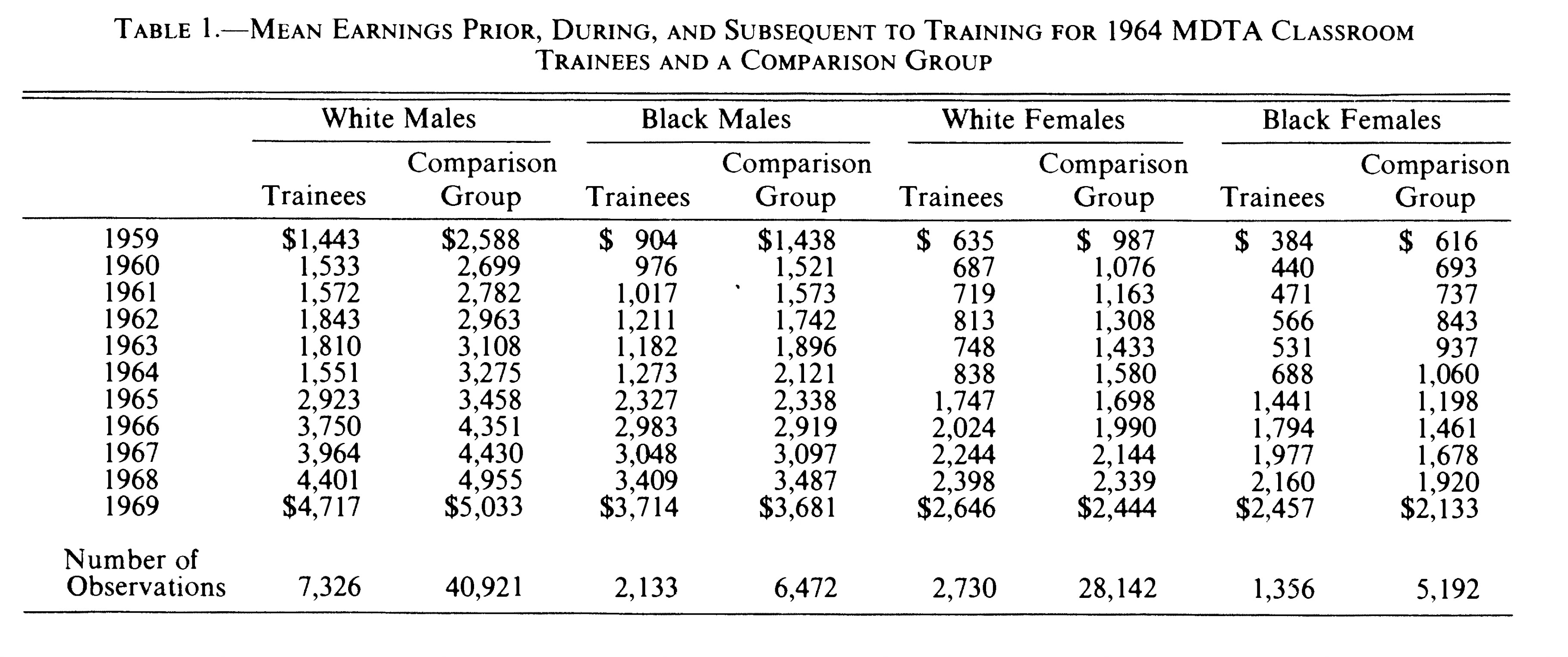
The Ashenfelter dip, first introduced by Orley Ashenfelter in his 1978 paper “Estimating the Effect of Training Programs on Earnings,” refers to a pattern where individuals experiencing a temporary dip in their earnings are more likely to enroll in training programs, hoping to improve their future prospects. In his study, Ashenfelter collected rich longitudinal data from two labor force surveys—one with job training participants and one without. He observed that trainee groups suffered significant declines in earnings in the year of training and experienced considerable increases afterward (Table 1 below). For example, from 1963 to 1964, White male trainees’ earnings fell from $1,810 to $1,551, while their controls didn’t experience this dip.
This selection mechanism, where decisions are influenced by recent negative changes in earnings, plays a crucial role in understanding causal inference in economic research. It’s not just about the numbers; it’s about the human stories behind those numbers—stories like Johnny’s, where personal experience and economic opportunity intersect to shape decisions that can alter the course of lives. Both Johnny’s and Orley’s selection mechanisms are forms of the Ashenfelter dip, a term coined by Jim Heckman. When earnings in one year fall below the year before, individuals are more likely to enroll in programs, reflecting broader patterns of economic behavior and inequality in initial conditions.
Previous Entries in this Series
In this Substack, we’re going to dive into the question of the Ashenfelter Dip as part of Pedro’s fourth step in his DiD checklist. This is another entry in my ongoing exploration of that checklist. Here are the other ones: (Step 1: Plot the Rollout; Step 2: Count the Units in each Cohort; Step 3: Plots the Evolution of Outcomes by Cohort; Step 4a and 4b on selection mechanisms).
Part 2: Simulating the Ashenfelter Dip and Selection Mechanisms
I am continuing to draw inspiration for this fourth step from a new paper by Ghanem and coauthors, which discusses various types of selection that are and are not consistent with parallel trends. There are several treatment assignment mechanisms in causal inference. Examples include:
Randomization
Rationality (Roy model)
Instruments
Covariates
Running variables
But here the selection mechanism will be Ashenfelter’s Dip. And I will define Ashenfelter’s Dip simply as that situation where a worker enrolls into a job training program if their earning growth is negative in the year before treatment. I’m trying to keep this as simple as I can, but I will include a couple of covariates. But as you’ll none of the covariates are needed to satisfy parallel trends — any violations are not based on those characteristics, but I include it for illustrative purposes.
First, generate the dataset
We will have 4 states and 1000 workers in each state who are one of four separate race categories (labeled 1 to 4). Each worker has their fixed effect drawn from the uniform distribution from $1,000 to $2,500. And there are six years in the data — 1987 to 1992
* step 4c.do. Ashenfelter's Dip as a treatment assignment mechanism
clear all
set seed 2

* First create the states
quietly set obs 4
gen state = _n

* Generate 1000 workers in each state
expand 1000
bysort state: gen unit_fe=runiform(1000,2500)
label variable unit_fe "Unique worker fixed effect per state"
egen id = group(state unit_fe)

* Generate race variable for different trends
gen race = mod(_n, 4) + 1

* Generate the years
expand 6
sort state
bysort state unit_fe: gen year = _n
gen n = year
replace year = 1987 if year == 1
replace year = 1988 if year == 2
replace year = 1989 if year == 3
replace year = 1990 if year == 4
replace year = 1991 if year == 5
replace year = 1992 if year == 6
Second, generate potential outcomes
* Generate potential outcomes
gen y0 = unit_fe + rnormal(0,10) if year == 1987

* Introduce trend and noise for subsequent years
gen trend = 5
bysort state unit_fe: replace y0 = y0[_n-1] + trend + rnormal(0,10) if year == 1988
bysort state unit_fe: replace y0 = y0[_n-1] + trend + rnormal(0,10) if year == 1989
bysort state unit_fe: replace y0 = y0[_n-1] + trend + rnormal(0,10) if year == 1990
bysort state unit_fe: replace y0 = y0[_n-1] + trend + rnormal(0,10) if year == 1991
bysort state unit_fe: replace y0 = y0[_n-1] + trend + rnormal(0,10) if year == 1992
I will be modeling all of this using potential outcomes as that helps us better understand parallel trends as well as makes it easier to measure the ATT, not to mention assign treatment based on changes in Y(0) at baseline. In the first year, a person’s untreated earnings is equal to their initial income (ranging from $1,000 to $2,500 as their fixed effect) plus some normally distributed shock. That gives us a minimum earnings of $991 in 1987 and a maximum earnings of $2,511.
Then we start the trend. In 1988, earnings rise by 5 plus another normally distributed shock. Then again in 1989, again in 1990, again in 1991, again in 1992. As this Y(0), it is the variable that will determine whether a comparison group and a treatment group are on comparable paths post-treatment. But no one has yet been treated. So let’s do that now.
Third, Select workers into treatment based on Ashenfelter’s Dip
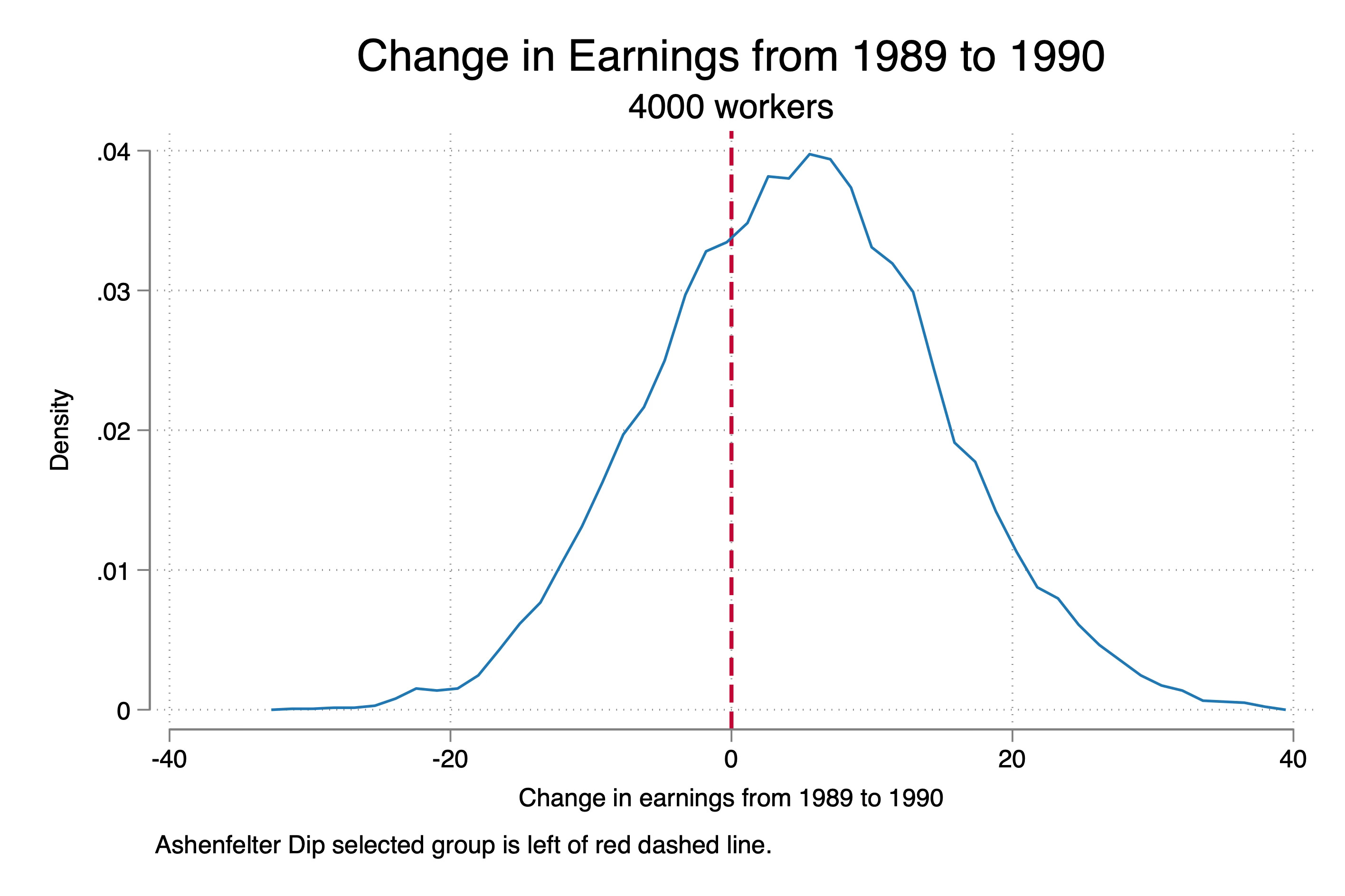
Now let’s use our Ashenfelter’s Dip mechanism to assign some of these 4,000 workers into the job program. And to do that, remember, we will use whether their untreated earnings “dipped” such that the year to year change in earnings fell from 1989 to 1990.
* Determine treatment status based on negative change from 1989 to 1990
bysort state unit_fe: gen delta_pre = y0 - y0[_n-1] if year == 1990
bysort state unit_fe: gen treat = 0
replace treat = 1 if delta_pre < 0 & year == 1990


// Define the labels for each unique value
label define treat_date_lbl 0 "never treated" ///
                      1 "Treated"

// Assign the labels to the treat_date variable
label values treat treat_date_lbl

* Ensure treatment status remains consistent
bysort id: egen max_treat = max(treat)
bysort id: replace treat = max_treat

* Plot the treatment group and control group
kdensity delta_pre, kernel(rectangle) xtitle("Change in earnings from 1989 to 1990") xline(0, lwidth(medthick) lpattern(dash) lcolor(cranberry)) title("Change in Earnings from 1989 to 1990") subtitle("4000 workers") note("Ashenfelter Dip selected group is left of red dashed line.")

graph export "./ashenfelter_dip.png", replace

reg treat i.state i.race, robust
There was a little more steps here. But let’s look at the top four lines first. I calculated the change in earnings from 1989 to 1990 as “delta_pre”. If your delta_pre variable was negative, you enrolled into the program, otherwise you didn’t. Below I show the distribution of these people. We end up with 7,764 people who enroll in the program, and 16,236 that don’t.
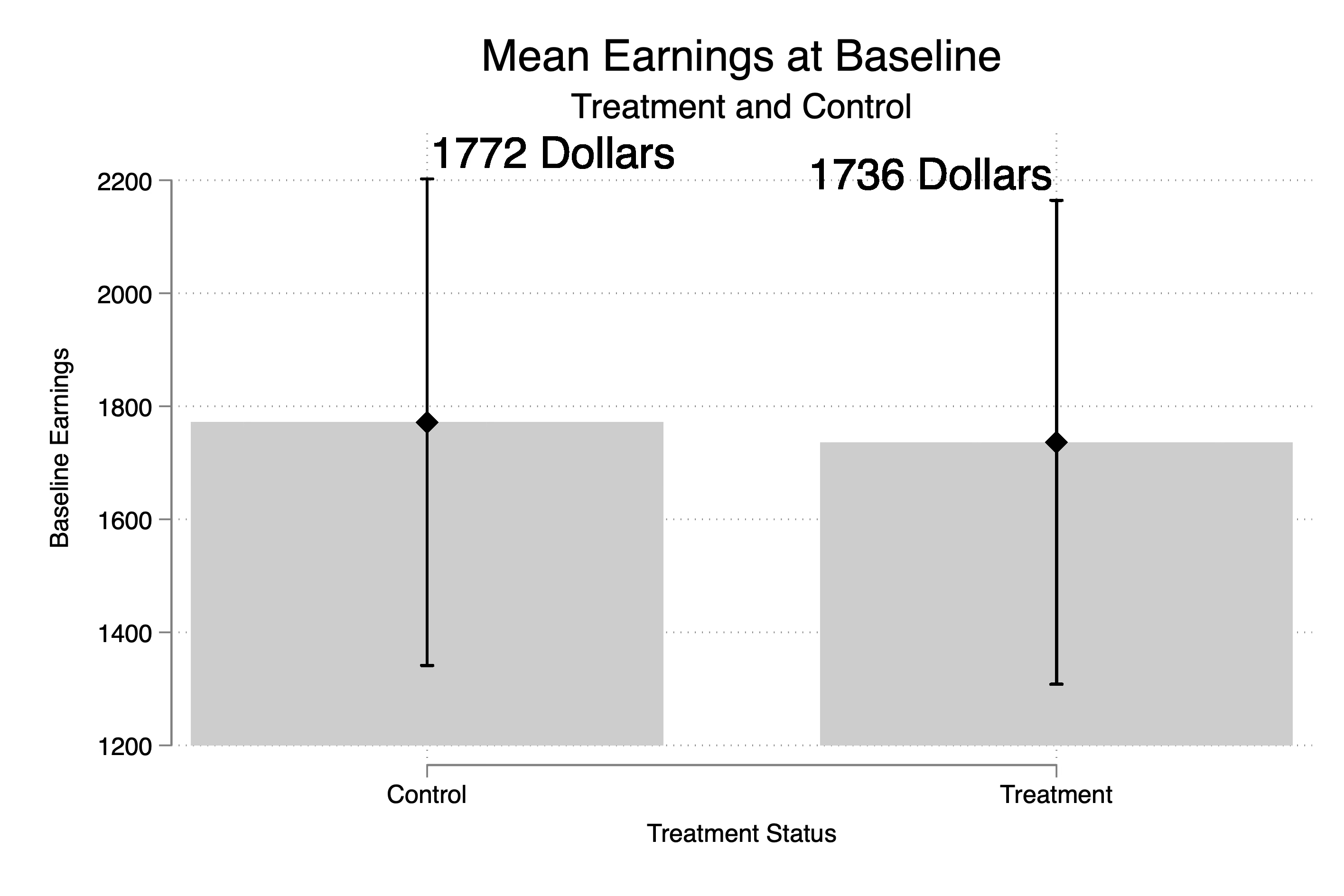
Next I wanted to see how the treatment and control groups differed from one another at baseline, but honestly they don’t really differ a lot on earnings at baseline. The treatment group is only $36 poorer than the treatment group. Similarly, treatment and control groups seem fairly similar on average in terms of their states where they live and their races. But I also ran a regression of treatment status onto state and race dummies. People living in state 2 and 3 are 2 percentage points more likely to be treated (recall 32% of the sample is treated).
The selection mechanism’s not really picking up on state and race because the Y(0) variable as you recall isn’t based on either of those. And so, since Y(0) is independent of race and state, then so is the change in Y(0). The only thing that determines treatment status is your change in Y(0) from 1989 to 1990 and as you recall, Y(0) is generated from this:
* Generate potential outcomes
gen y0 = unit_fe + rnormal(0,10) if year == 1987

* Introduce trend and noise for subsequent years
gen trend = 5
bysort state unit_fe: replace y0 = y0[_n-1] + trend + rnormal(0,10) if year == 1988
bysort state unit_fe: replace y0 = y0[_n-1] + trend + rnormal(0,10) if year == 1989
bysort state unit_fe: replace y0 = y0[_n-1] + trend + rnormal(0,10) if year == 1990
bysort state unit_fe: replace y0 = y0[_n-1] + trend + rnormal(0,10) if year == 1991
bysort state unit_fe: replace y0 = y0[_n-1] + trend + rnormal(0,10) if year == 1992
And unit fixed effects were draws from the uniform distribution. I encourage you to make Y(0) a function of race and state and see, though, just how far this matters.
Fourth, Generate Y(1) and treatment effects
We will be estimating diff-in-diff, and so I will will generate a post dummy (1991 and 1992 are the post periods), and I will generate the potential outcome Y(1) which we need for defining our treatment effects and our switching equation. At baseline, Y(1) equals Y(0) which is my way of building into this simulation “No Anticipation”. That is, there is no treatment effect until the units are treated and they don’t get treated until 1991. In 1991, the treatment effect of the program is $100 and in 1992, it’s $300. This makes the ATT (100+300)/2 or $200, which is what we find in the last line too. So our benchmark target is $200.
* Post-treatment variable
gen post = 0
replace post = 1 if year >= 1991

* Generate y1 by adding treatment effect for treated units
gen y1 = y0
replace y1 = y0 + 100 if year == 1991 & treat == 1
replace y1 = y0 + 300 if year == 1992 & treat == 1

* Treatment effect
gen delta = y1 - y0
label var delta "Treatment effect for unit i (unobservable in the real world)"

sum delta if treat==1 & post==1, meanonly
gen att = `r(mean)'
su att // ATT is $200

* Generate observed outcome based on treatment assignment
gen earnings = y0
qui replace earnings = y1 if post == 1 & treat == 1
And then the last step is the switching equation. If you’re treated and it’s the post period, earnings is Y(1) otherwise your earnings is equal to the untreated potential outcome Y(0).
Fifth, Visualize Y(0) and Y
Now ordinarily, you do not have the luxury of visualizing the potential outcome Y(0), but this is a simulation so we can. Remember, the potential outcome is not the realized outcome, so for the treatment group to the right, we will be focused just on the counterfactual.
* Visualize the evolution of Y(0)
preserve
collapse (mean) y0, by(treat year)
xtset treat year

* Create individual plots with reference lines
twoway (line y0 year if treat == 1, lcolor(blue) lwidth(medium)) ///
       (line y0 year if treat == 0, lcolor(red) lwidth(medium)), ///
       xline(1990.5, lcolor(black) lpattern(dash)) ///
       legend(order(1 "Treated" 2 "Control")) ///
       title("Evolution of Y(0) for Treatment and Control Groups") ///
       xtitle("Year") ytitle("Mean Y(0)") ///
       xlabel(1987(1)1992)

graph export "./y0_evolution.png", replace
restore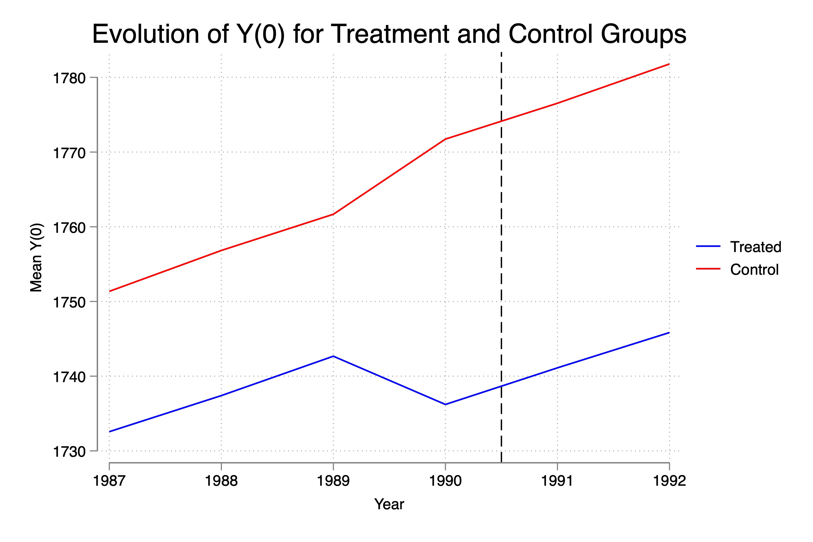
This here is the trend in Y(0) for our two groups. Now as I said, at baseline they are around $36 apart, but the rest of the time, they are around $20 apart. Kind of interesting in a way because what this means is that we selected on delta Y(0)<0 but this caused not only the control group to have a dip — it caused the treatment group to have a rise. That’s because of the selection itself — we cut off the left part of the distribution in delta_pre. Which means the control group only consists now of people whose earnings rose that year. It’s mechanical and it’s a function of the sample size. Were it that the selection rule had been something like enrollment only for those at the 25th percentile and had 100,000 workers, perhaps the slight increase in delta_pre left over for the control group would’ve been barely visible, but here it is.
Second thing is that this selection mechanism when it selected on delta_pre<0 also generated differences in levels, not just differences in levels at baseline itself. I don’t have a great (or any) explanation for this except to say it must be that that change in earnings from 1989 to 1990 was selecting on people who were also poorer in every other year. We know that Y(0) at baseline is part of the changes because every year it is Y(0) + 5 + e(0,10) so Y(0) is in the rule, but it should be canceling out in the difference as the selection should be just on the error itself. So I need to think more about that. But for some reason, we are slicing off the sum of two random variables who by sheer randomness generated just enough of a shock in the two periods that it fell. May want to experiment with larger samples to see if those gaps close, and if they don’t, well I need to then think more about it.
But third thing, look at the post period. Though they dipped in earnings in 1990, notice how they recover. Now this is again because the entire sample has the same potential outcome trend. Look again closely:
* Generate potential outcomes
gen y0 = unit_fe + rnormal(0,10) if year == 1987

* Introduce trend and noise for subsequent years
gen trend = 5
bysort state unit_fe: replace y0 = y0[_n-1] + trend + rnormal(0,10) if year == 1988
bysort state unit_fe: replace y0 = y0[_n-1] + trend + rnormal(0,10) if year == 1989
bysort state unit_fe: replace y0 = y0[_n-1] + trend + rnormal(0,10) if year == 1990
bysort state unit_fe: replace y0 = y0[_n-1] + trend + rnormal(0,10) if year == 1991
bysort state unit_fe: replace y0 = y0[_n-1] + trend + rnormal(0,10) if year == 1992
See how y0 is for everyone equal to baseline y0 plus 5 plus noise with mean zero? The only thing that could ever violate parallel trends, then, is if the sample was slicing on groups who had different trajectories in post-treatment y0. But see the y0 is always going to be “some baseline value plus 5 plus on average 0” no matter how you assigned the treatment. So this guarantees parallel trends.
For us to really start diving into this at a deeper level, which I may do another day, we are going to need to generate a lot more heterogeneity in y0 — perhaps by race and state, for instance. But at the moment, the point I want to make is that because all units followed the same trajectory, Ashenfelter’s dip is not going to probably have a material effect on parallel trends violation, though you’ll see it does somewhat.
Sixth, Visualize the evolution of the outcomes
Now the only data you will have access to in a study are realized outcomes, or in this case, “actual” earnings, not theorized earnings under different hypothetical states of the world. So I’ll plot that now too.
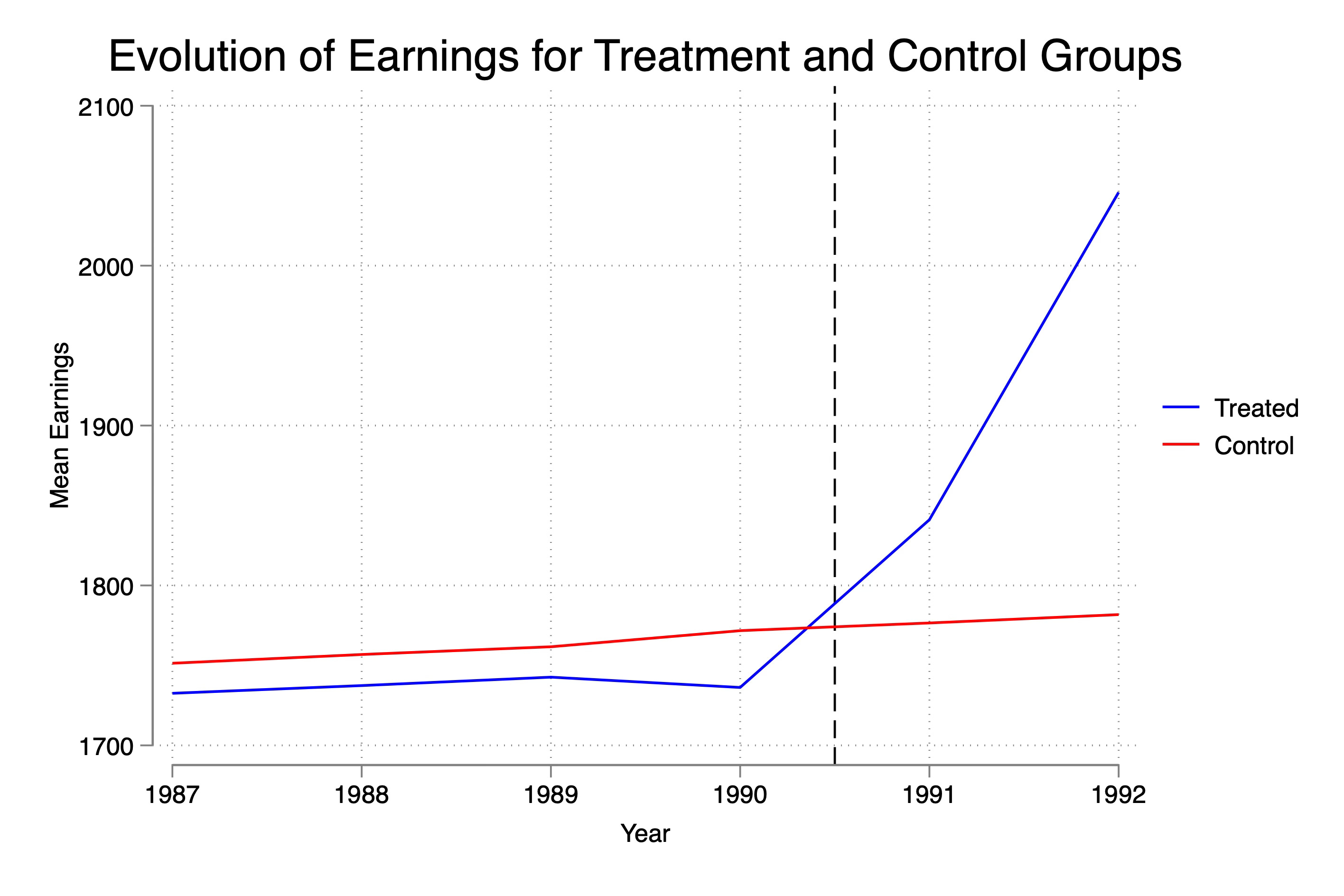
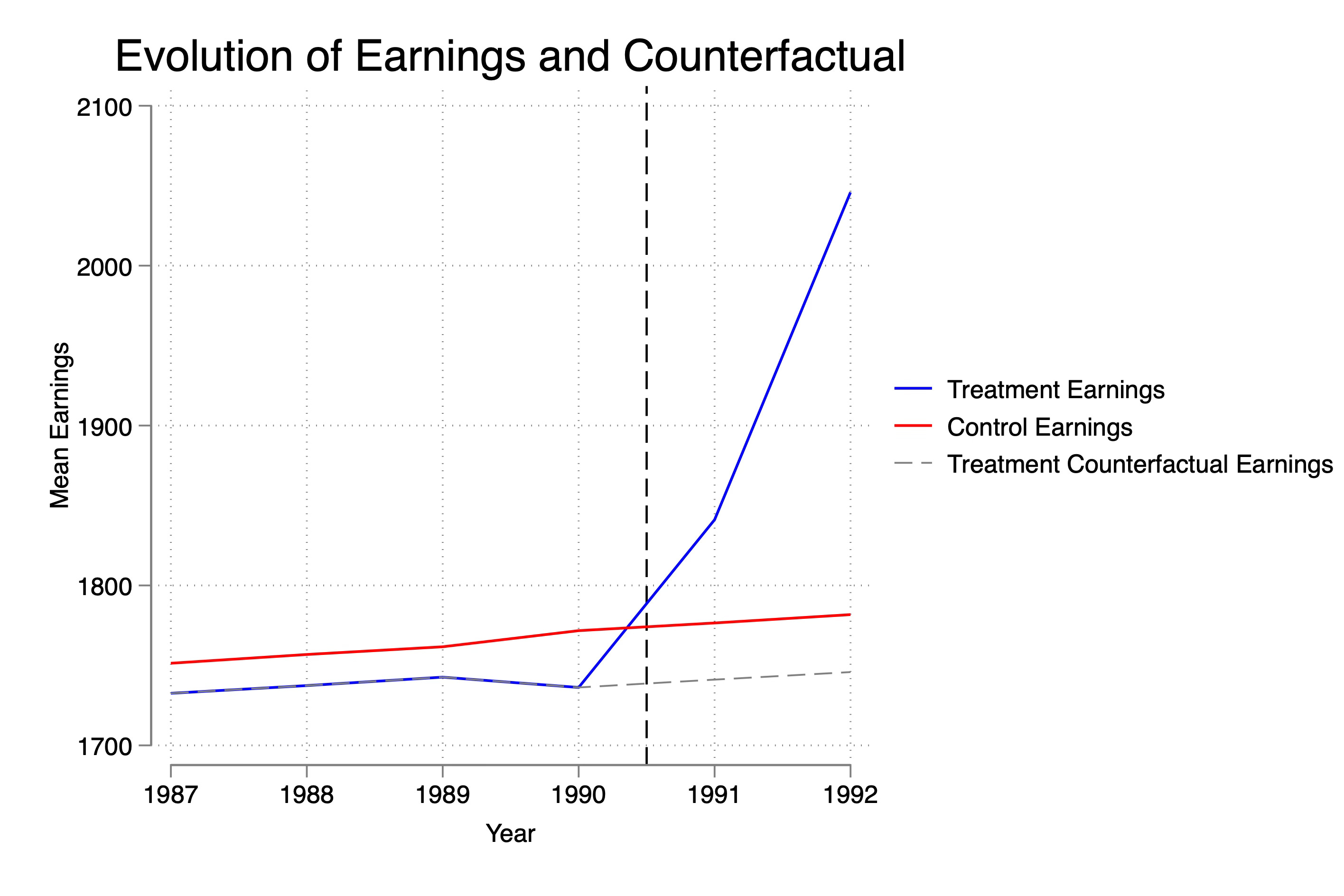
Here you see the dip as before, you see the inequality at baseline as before, and you see the large relative increase in earnings post-treatment. Let’s overlay now both treatment and control earnings with the treatment group’s counterfactual earnings (Y(0)), so you can see that despite the dip, parallel. trends holds modestly.
Okay, I think we are ready. Let’s estimate the ATT and estimate event studies too.
Seventh, Estimated ATT and Event Studies
Next I estimated the ATT using a static model and a dynamic model. I’ll also plot the event study so you can see it. Recall that the ATT is $200. And that the treatment effect in year 1991 was $100 and in year 1992 $300. We are doing better at estimating those than we are at estimating the overall, which is worth thinking about. Why might you think that the simple ATT is slightly more biased than the point estimates on the post-treatment coefficients. (Hint: Think about what the baseline is for the first regression versus the second…)
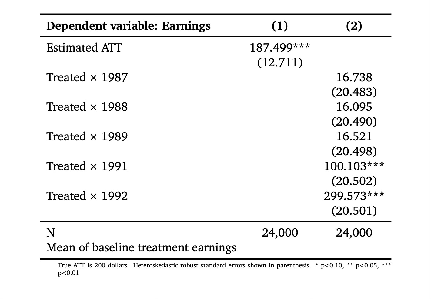
* Regressions
estimates clear
reg earnings post##treat, robust
reg earnings treat##ib1990.year, robust
The baseline in the first regression is the entire pre-treatment period, and we know that Y0 fell in baseline causing the parallel trends assumption to change slightly. But when we used only the baseline value of 1990, as you can see in the previous figure, it had mostly recovered. Now let’s look at the event study plot from that second regression. I’ll reproduce it for those who want the code.
* Event study
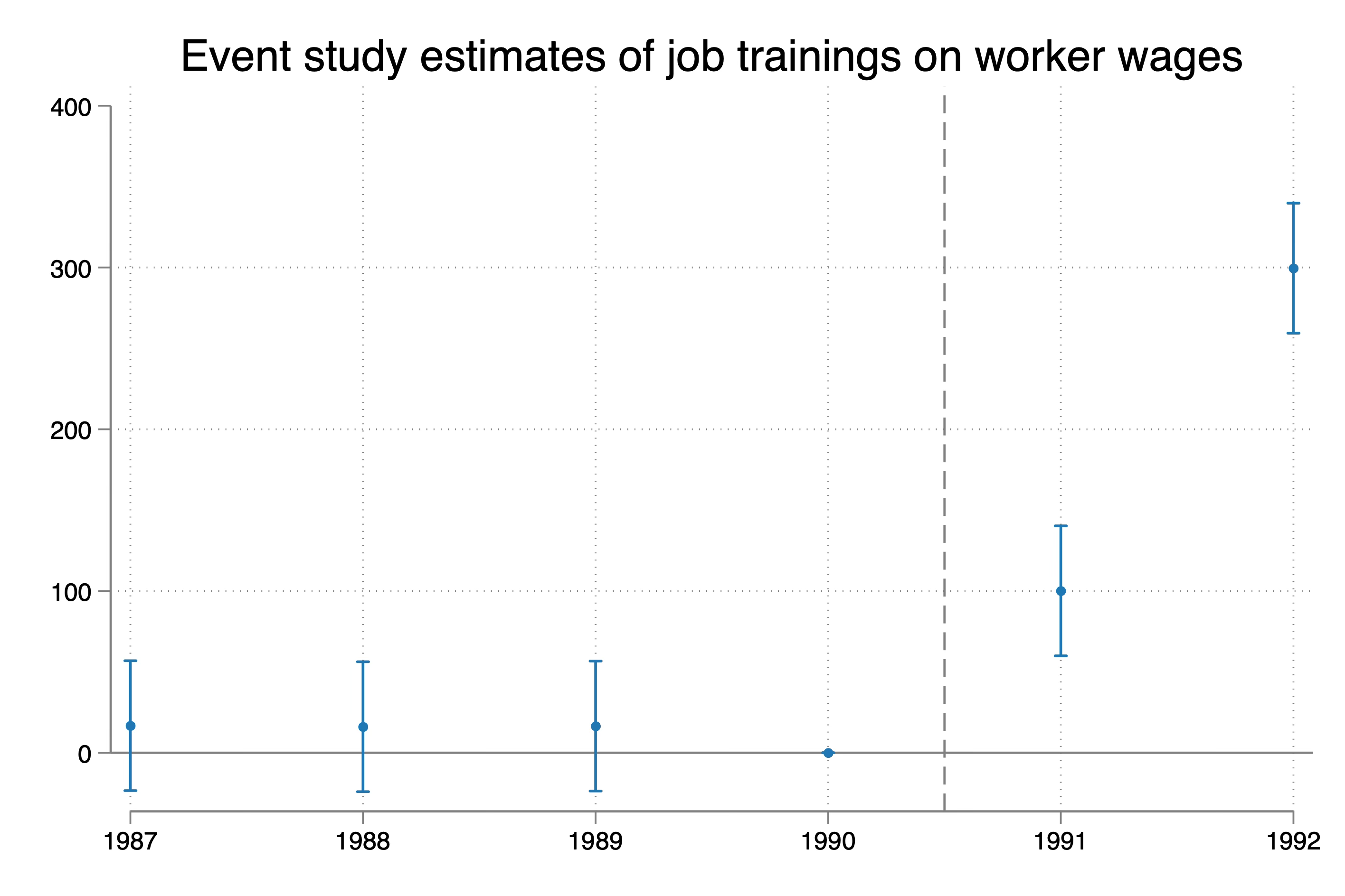
reg earnings treat##ib1990.year, robust
coefplot, keep(1.treat#*) omitted baselevels cirecast(rcap) ///
rename(1.treat#([0-9]+).year = \1, regex) at(_coef) ///
yline(0, lp(solid)) xline(1990.5, lpattern(dash)) ///
title("Event study estimates of job trainings on worker wages") ///
xlab(1987(1)1992)
So here we see that we are dead accurate on the ATT estimates for 1991 and 1992. Their truth is 100 and 300 dollars, and the estimates are 100 and 300 dollars. The 95% confidence intervals on the 1991 estimate ranges from $60 to $140. The 95% confidence interval on the 1992 estimate ranges from $259 to $339. Pretty good right?
Eighth, biased event studies
But look closely at the pre-trends. They aren’t zero point estimates. Now they’re statistically insignificant, but they aren’t technically zero. I’m going to re-estimate this including worker fixed effects real quick. I think you’re going to be a little surprised.
areg earnings treat##ib1990.year, robust a(id)
I decided to plot this a bit differently because I wanted you to see this more clearly. First, notice that the confidence intervals become invisible. That’s because of how precisely estimated the coefficients are. So that is in fact great news. The ATT estimates are much more precise when we include worker fixed effects. The 95% confidence intervals for both 1991 range around +/- 70 cents. And for 1992, it’s around +/- $150. So we have very precisely estimated point estimates around the true effect. Let’s celebrate the small victories when we can.
But as Spider-man said, with great power comes great responsibility. Note that the pre-trends are abysmal now. They are all positive and significant. Why is that? Did parallel trends break since the pre-trends are not zero? Well, we can check actually because we have the Y(0) variable, whereas ordinarily you don’t. So run this:
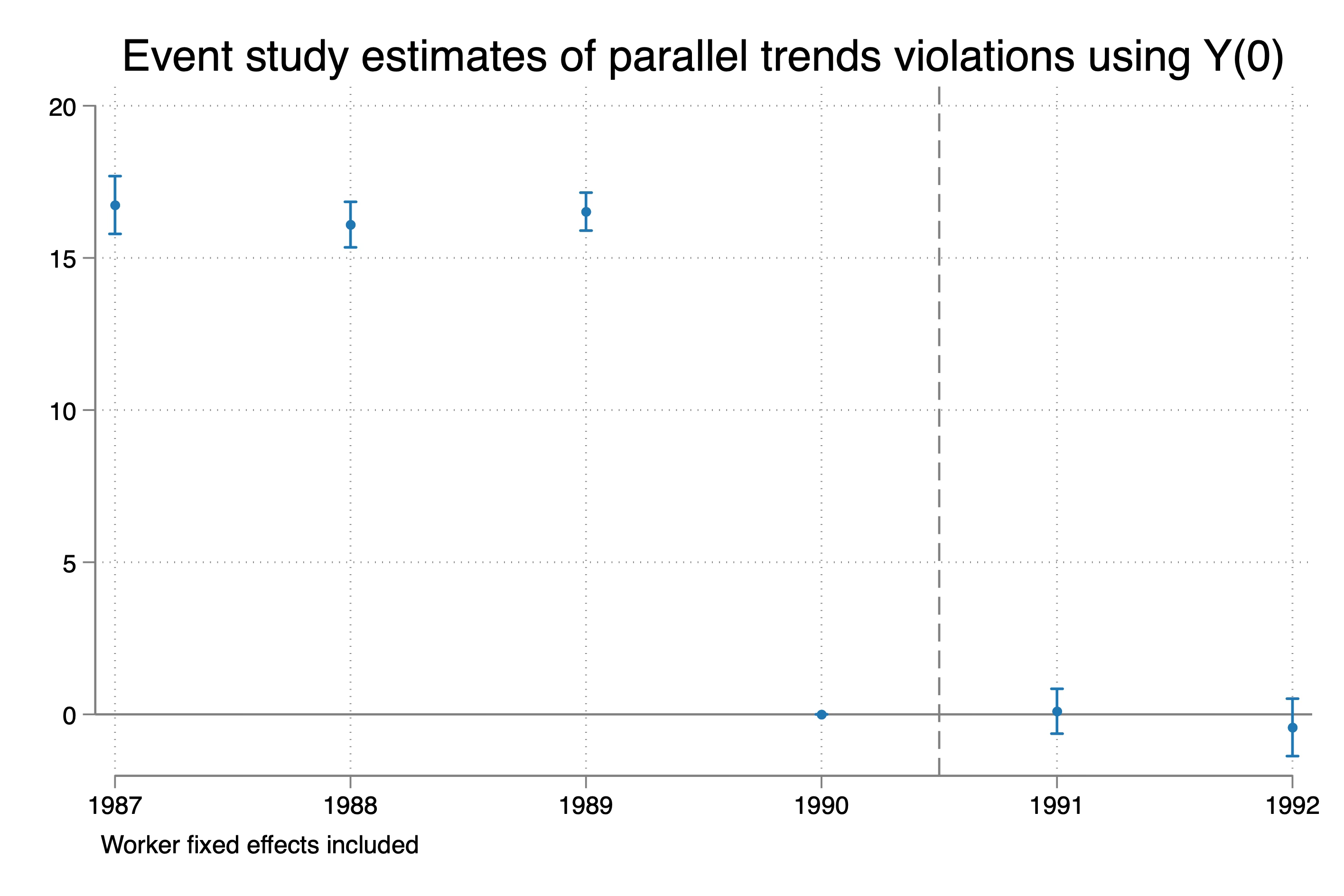
* Event study on y0
areg y0 treat##ib1990.year, robust a(id)

coefplot, keep(1.treat#*) omitted baselevels cirecast(rcap) ///
    rename(1.treat#([0-9]+).year = \1, regex) at(_coef) ///
    yline(0, lp(solid)) xline(1990.5, lpattern(dash)) ///
	title("Event study estimates of parallel trends violations using Y(0)") ///
	note("Worker fixed effects included") ///
    xlab(1987(1)1992)

graph export ./dip_es_y0.png, as(png) replace
Wow. What is going on? Well, before I tell you what is going on, let me put up for you a quote from the abstract of Kahn-Lang and Lang (2020). The entire screenshot is here:
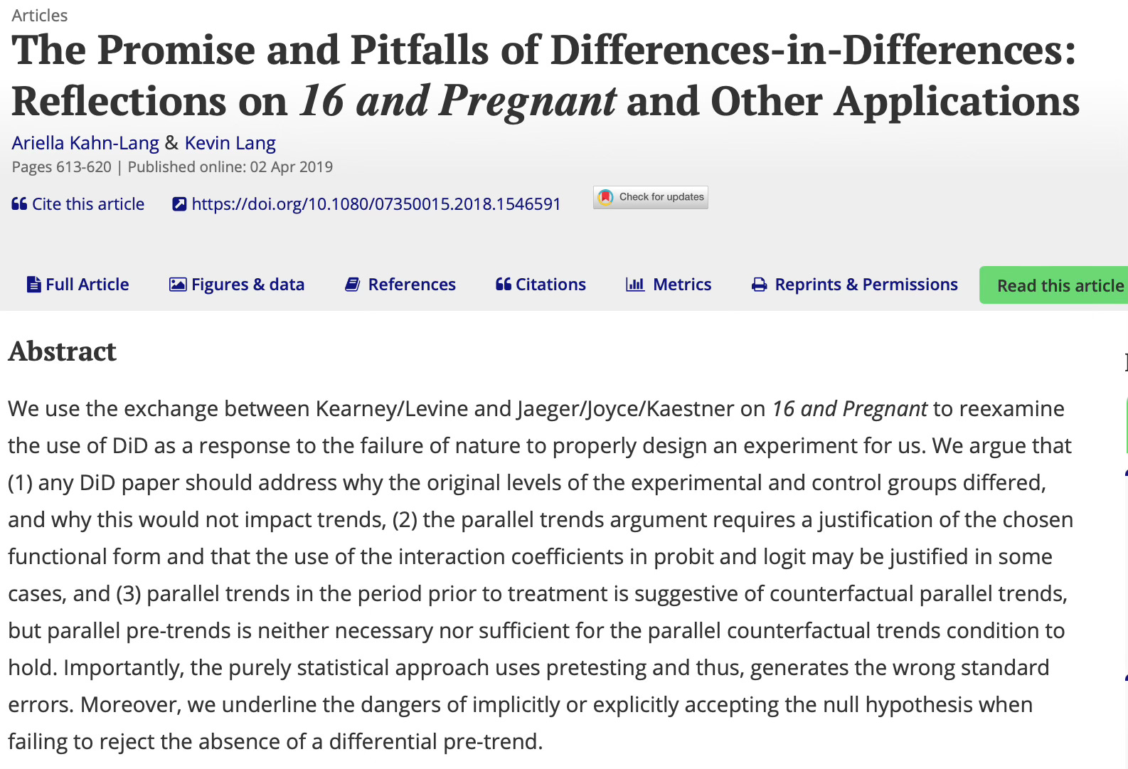
Look closely at point (3) in the abstract: “(3) parallel trends in the period prior to treatment is suggestive of counterfactual parallel trends, but parallel pre-trends is neither necessary nor sufficient for the parallel counterfactual trends condition to hold.”
Well, we just showed that they are in fact right. Pre-trends are not zero, but post trends in Y(0) (i.e., the measure of parallel trends bias) are zero. Why?
The reason is that the selection into treatment was based on dips at baseline. The change in Y0 specifically. But the parallel trend starts at t-1 (i.e., 1990) for these event studies. And what is happening is that post-treatment, where there is no longer any sudden change in Y(0), all post-treatment parallel trends hypotheses are correct. Indeed, the change in Y(0) from 1990 to 1991 or from 1990 to 1992 is exactly that of our comparison group. But the change in Y(0) from 1987 to 1990 or 1988 to 1990 is not because recall in 1990, they had that dip.
You can try other specifications (maybe dropping 1989 instead of 1990 or 1987 instead of 1990), and it won’t matter. Because while moving the baseline back in time to an earlier period can then cause the change over time, year to year, in the pre-treatment coefficients to be zero, you are violating parallel trends from those earlier points. Remember — parallel trends is always from and only from the baseline you chose. And our parallel trend had always been with respect to 1990, even though 1990 was the very year in which they saw the dip. If we roll back the dropped year, it is true that the coefficients on the pre-trends become zero, but then the “true effect” is no longer identified.
* Regressions
estimates clear

areg earnings treat##ib1990.year, robust a(id)
				cap n estimates store att1
				cap n estadd ysumm

areg earnings treat##ib1989.year, robust a(id)
				cap n estimates store att2
				cap n estadd ysumm

areg earnings treat##ib1988.year, robust a(id)
				cap n estimates store att3
				cap n estadd ysumm

areg earnings treat##ib1987.year, robust a(id)
				cap n estimates store att4
				cap n estadd ysumm
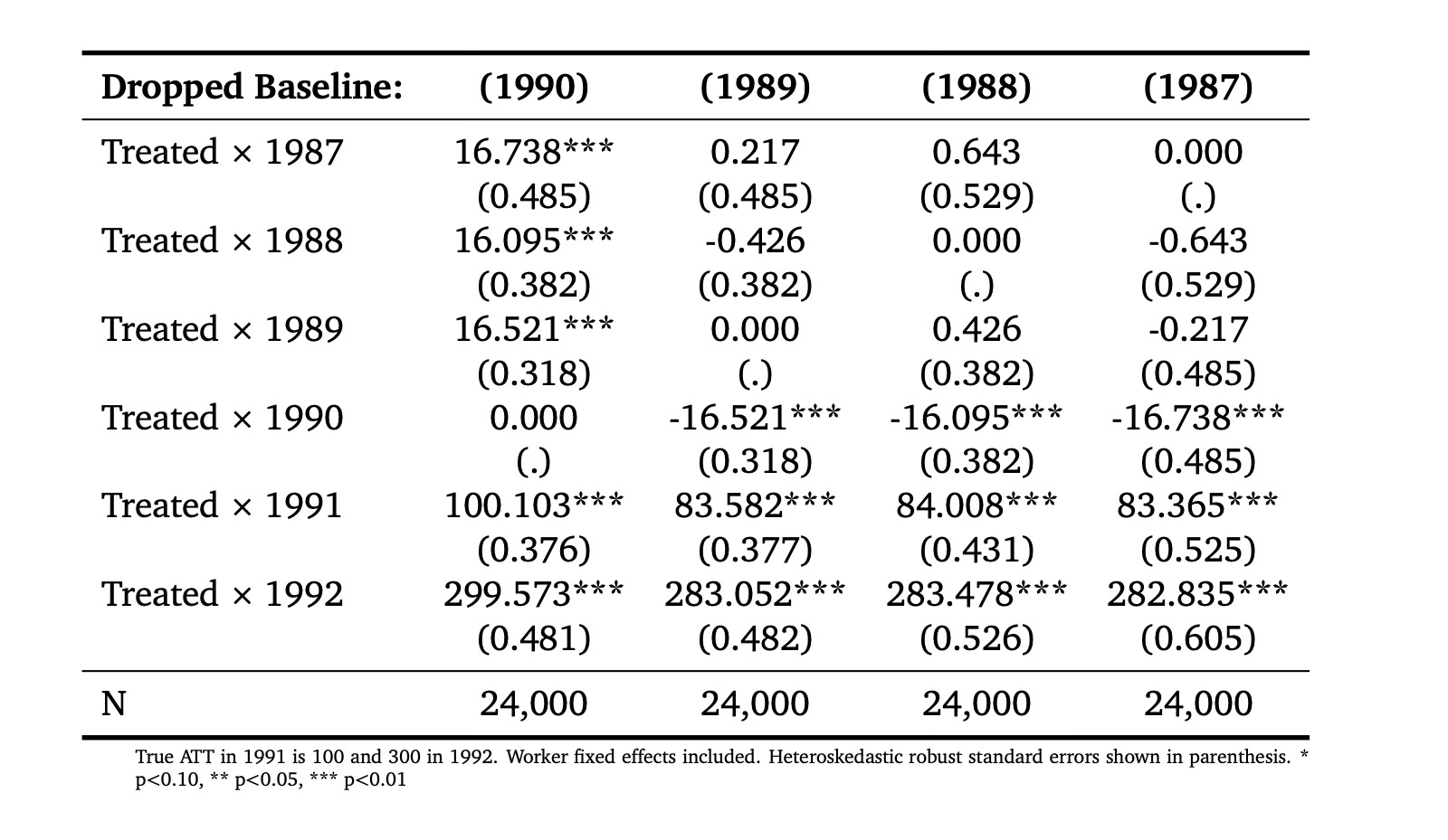
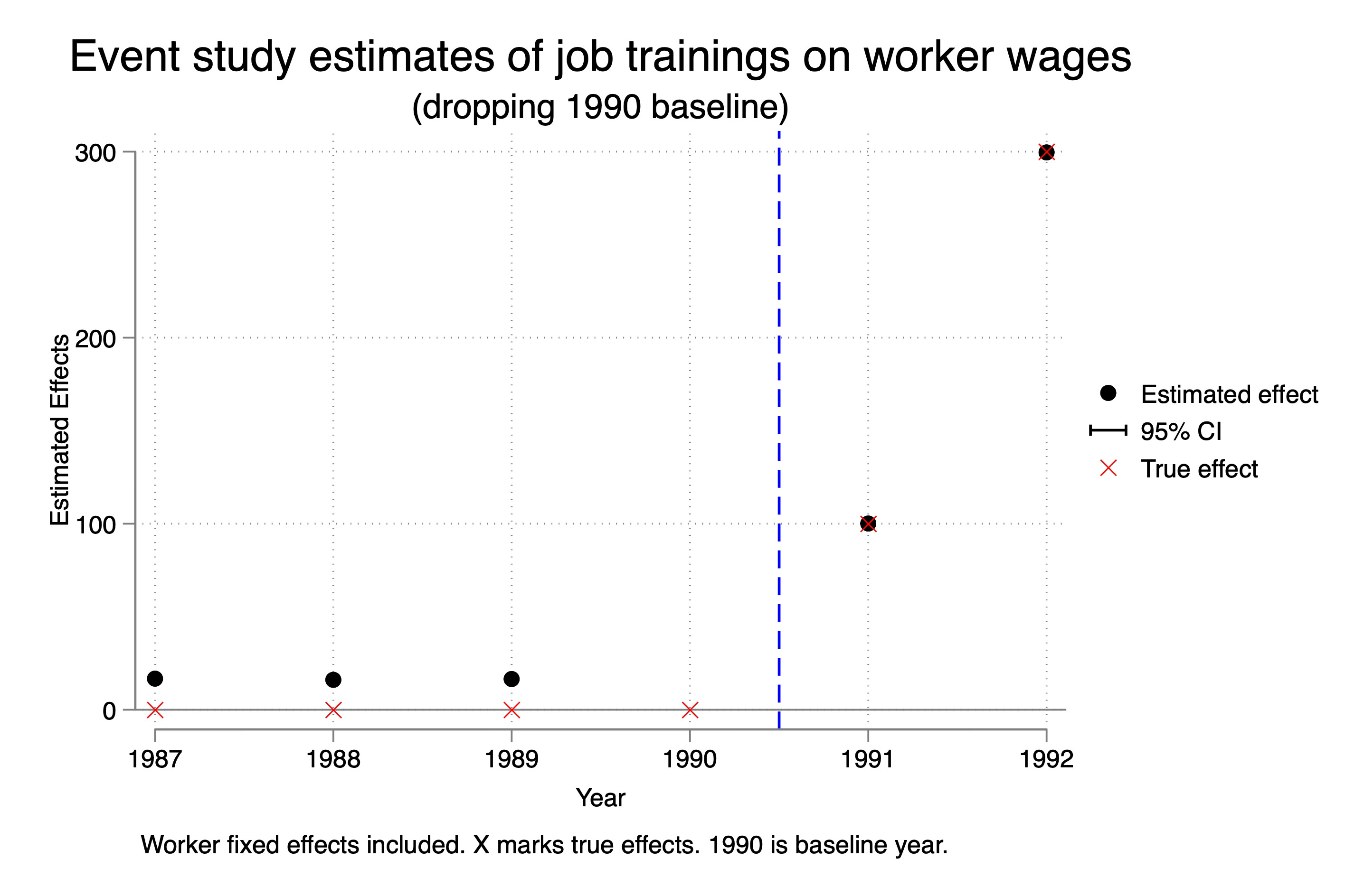
So check that out. Column 1990 (where we dropped 1990 as the baseline) has the correct event study estimates of the ATT, but has absymal pre-trends. But when we drop 1989, 1988 or 1987, look what happens — the pre-trends and the post-treatment estimates of the event study parameters become stable and wrong. This is interesting because we are often trained to think that if we experiment with different specifications and our point estimates of interest become stable that therefore we have found the correct specification. When in fact that isn’t true here. Our point estimates became stable because the parallel trend bias from each of those other three years was always wrong by around -16 dollars.
Let’s just choose one of these, then, and illustrate it on an event study so you can see. Remember — we know that the ATT in 1991 is 100, and we know the ATT in 1992 is 300. So we know column 1, dropping 1990, was the correct specification because that was the point where parallel trends held, and that’s why those estimates were correct. But let’s try now to visualize what happened when we used column 2 — dropping 1989.
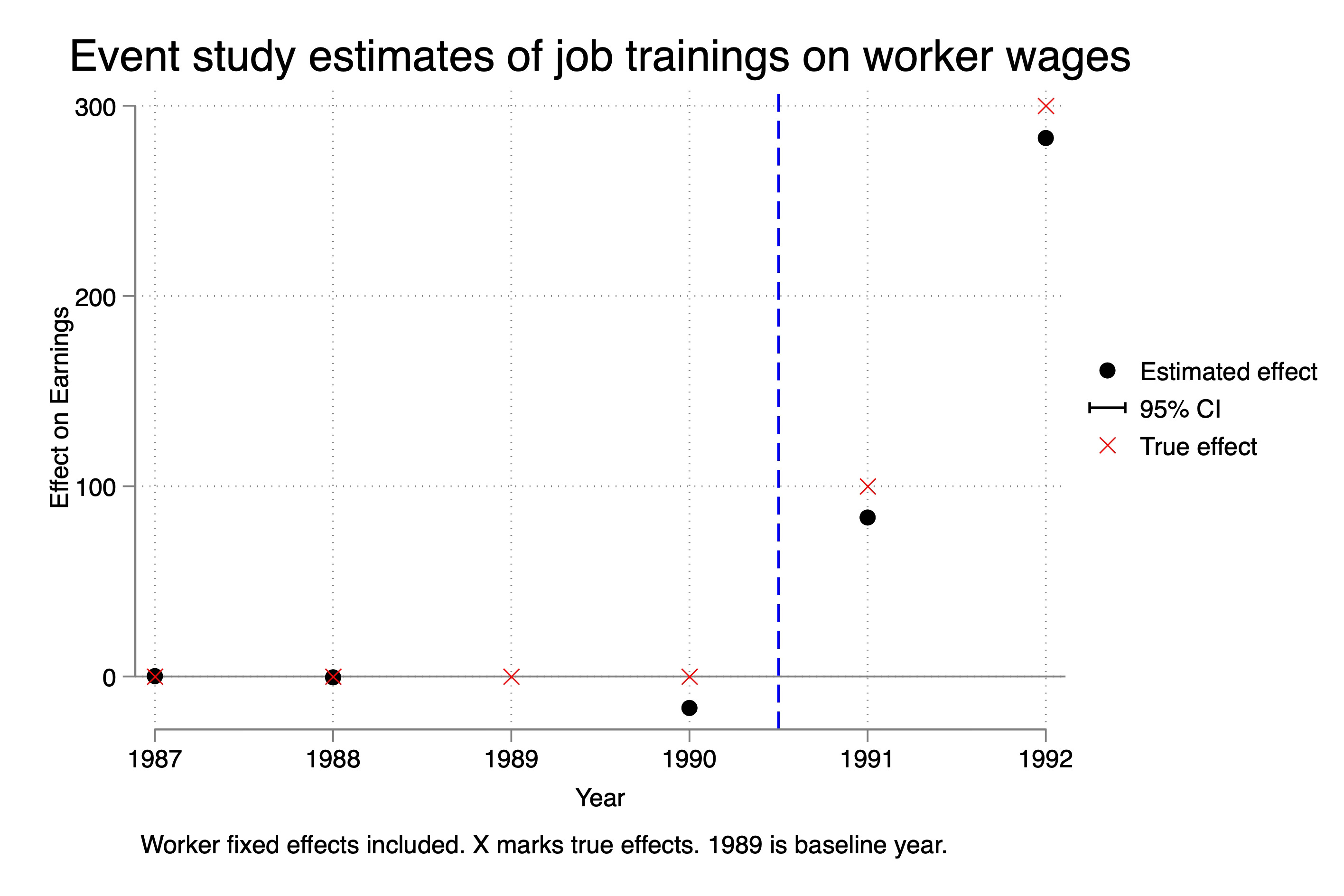
As you can see, the point estimates here are wrong. The true effect is the red X. The black dot is our estimate if we estimated it using this incorrect specification. And again, why did it happen? Because in our Ashenfelter Dip selection mechanism that we used, the parallel trends assumption was with respect to 1990, not 1989. And so while we could keep rolling back the baseline, and the estimated ATT on the event study plots became “stable”, they also became incorrect.
Part 3: Discussion and Conclusion
What do I want to say about this? Well, first of all, we saw an example of Ashenfelter’s dip, and that was interesting, as that’s kind of classic. Now it’s a particular version of Ashenfelter’s dip, but still, it’s a version of it. You can go back to the early quote by Orley and he notes that his trainees saw declines in earnings prior to treatment and that’s what we generated here.
But our Ashenfelter’s Dip was a very specific kind of treatment assignment mechanism and this particular kind of mechanism is going to be problematic for you and here’s why. Because the selection into treatment happened due to a dip in earnings from t-2 to t-1, all the pre-trend plots would necessarily be non-zero. Mechanically they are non-zero. But all of the post-treatment estimates are unbiased. We showed that in several ways — we showed it using event study plots, and we showed it estimating Y(0) itself in an event study plot. The parallel trends assumption held post but not in the pre-trends.
This is just one thing you need to remember — when someone tells you they “proved parallel trends holds” because pre-trends held, just remember, they are using vague language that is not precisely correct. The pre-trends are our best guess that we chose the correct control group, but weirdly enough, in this case, you would’ve thrown away this control group and sought a different one even though this control group satisfies parallel trends.
That’s the paradox for you — without an understanding of the treatment assignment mechanism, you simply will not be able to discern whether this kind of selection into treatment is or is not going to be a problem. There are some mechanisms, in other words, that assign units to treatment which satisfy parallel trends but interestingly enough violate pre-trends!
I’m going to stop here. This went way too long. I hope this was helpful.