


Step (2) of Pedro's DiD checklist: documenting how many units are in each cohort
Step (2) of Pedro's DiD checklist: documenting how many units are in each cohort
Happy Father's Day!!

I am going to continue walking us through Pedro Sant’Anna’s difference-in-differences checklist (“Pedros checklist”) with a focus on step 2. It’s pretty straightforward, but still as I wanted to show code, I thought I’d make it just one substack entry rather than combine it with step 3. Step 2 is “Document how many units are treated in each cohort.”
For this substack, I’m going to mix things up. I’ll be using the state level panel data on crime and concealed carry laws from Aneja, Donohue and Zhang (2011). The paper is titled “The Impact of Right-to-Carry Laws and the NRC Report: Lessons for the Empirical Evaluation of Law and Policy” and was published in the 2011 American Law and Economics Review. I’ve uploaded these data to my GitHub repo to make them easier to download in the code that I use for this substack.
A little about the data
The dataset used in this paper includes a wide array of possible crimes, sourced from the FBI’s Uniform Crime Reports (UCR) Type 1 series. For those who are not from the USA, or who don’t work on crime using these data, let me briefly tell you about it. The FBI started the UCR program in 1930 in order to generate reliable crime statistics for law enforcement administration, operation, and management. The program includes data from over 18,000 law enforcement agencies, although participation in UCR is voluntary so there isn’t full cooperation. Some agencies consistently report complete data per month, some submit their counts for the entire year, some have gaps, some don’t report at all, even though others in the same state will, and sometimes it goes in and out. Despite these variations, the UCR remains one of the most comprehensive sources of crime data in the United States, offering crucial insights into crime patterns and aiding in policy evaluation. And as it’s available for all states, you can use it for difference-in-differences, whereas with higher quality administrative data from a single jurisdiction, you cannot do the same kind of program evaluation (but you can others).
The Type I series covers eight so-called index crimes considered the most serious and most likely to be reported across the country, as well as classified in a similar way by jurisdictions in different states. There are four violent crimes (murder and manslaughter, forcible rape offenses involving female victims only [this has changed and is different for other UCR datasets, but for the dataset we will use, it uses the forcible and reported female rape offenses classification]), robbery and aggravated assault. And then there are four property crimes: burglary (breaking or entering or both), larceny-theft (excluding motor vehicle theft), motor vehicle theft and arson (which was added in 1979).
The authors data runs from 1970 to 2007 and covers 51 panel units: 50 US states plus Washington DC. The data quality ranges on these, with DC usually being notoriously bad. Authors should review the literature produced by criminologists and economists on these data before using them. But for our purposes, we will just be taking the data as is, since these are the data that Aneja, Donohue and Zhang (2011) used in their ALER paper on concealed carry. And for our purposes here, just remember that concealed carry will be a state statute allowing people to carry weapons in public and also conceal them from other people when they do so.
Step 0: Creating the treatment date variable
Back in the old days, before all this timing group material became so salient, I would manually generate dummy variables equalling 1 if a state was treated, 0 if not. I would not in other words generate a variable identifying the year in which a unit was treated.
There is a “pre-stage” checklist item that I’ll just call “Step 0” in which you generate a cohort variable identifying the year in which that panel unit was treated. Recall that Step 2 is going to be to count those units, so we need it anyway. But you also need this variable for most if not all the robust DiD methods’ Stata and R (and python) syntax, so I’ll show myself doing that now since it was not done in the state-level panel dataset I got from Aneja, Donohue and Zhang (2011).
You also in these new packages need to replace a missing treatment date (which is what a never treated group will be) with a 0 as the packages require that you identify all groups with a number, and neither a period and NA are not numbers as those are Stata and R displays for missing values. So ordinarily, you’ll replace the group variable with a zero if they were never treated when you’re ready to do your analysis.
But for this particular part of the checklist, using panelView, I actually have to do something else. I need to change the treat_date variable to a distant future value (beyond the last date of our panel) otherwise panelView won’t show the never treated because it doesn’t show units whose treatment dates are listed as zero. So I changed treat_date to equal 2020 for the never treated in order to accommodate the panelView syntax. But you can do whatever you want so long as your graph shows all panel units by cohort status.
clear all
capture log close

cd "/Users/scunning/Library/CloudStorage/Dropbox-MixtapeConsulting/scott cunningham/0.1 Mixtape Consulting/Substack/Code"

use https://github.com/scunning1975/mixtape/raw/master/concealed_carry_state.dta, clear

* Load packages needed for panelView
* net install grc1leg, from(http://www.stata.com/users/vwiggins) replace
* net install gr0075, from(http://www.stata-journal.com/software/sj18-4) replace
* ssc install labutil, replace
* ssc install sencode, replace
* cap ado uninstall panelview //in-case already installed
* net install panelview, all replace from("https://yiqingxu.org/packages/panelview_stata")

* Generate a treatment date variable
gen     treat_date = 2020 	// never treated
replace treat_date = 1970 if shalll==1 & aftr==0 // always treated
replace treat_date = 1994 if fipsstat==2 		 // treatment cohorts
replace treat_date = 1994 if fipsstat==4
replace treat_date = 1995 if fipsstat==5
replace treat_date = 2003 if fipsstat==8
replace treat_date = 1987 if fipsstat==12
replace treat_date = 1989 if fipsstat==13
replace treat_date = 1990 if fipsstat==16
replace treat_date = 1980 if fipsstat==18
replace treat_date = 2006 if fipsstat==20
replace treat_date = 1996 if fipsstat==21
replace treat_date = 1996 if fipsstat==22
replace treat_date = 1985 if fipsstat==23
replace treat_date = 2001 if fipsstat==26
replace treat_date = 2003 if fipsstat==27
replace treat_date = 1990 if fipsstat==28
replace treat_date = 2003 if fipsstat==29
replace treat_date = 1991 if fipsstat==30
replace treat_date = 2006 if fipsstat==31
replace treat_date = 1995 if fipsstat==32
replace treat_date = 2003 if fipsstat==35
replace treat_date = 1995 if fipsstat==37
replace treat_date = 2004 if fipsstat==39
replace treat_date = 1995 if fipsstat==40
replace treat_date = 1990 if fipsstat==41
replace treat_date = 1989 if fipsstat==42
replace treat_date = 1996 if fipsstat==45
replace treat_date = 1994 if fipsstat==47
replace treat_date = 1995 if fipsstat==48
replace treat_date = 1995 if fipsstat==49
replace treat_date = 1988 if fipsstat==51
replace treat_date = 1989 if fipsstat==54
replace treat_date = 1994 if fipsstat==56

// Define the labels for each unique value
label define treat_date_lbl 2020 "never treated" ///
                      1970 "always treated" ///
                      1980 "1980 cohort" ///
                      1985 "1985 cohort" ///
                      1987 "1987 cohort" ///
                      1988 "1988 cohort" ///
                      1989 "1989 cohort" ///
                      1990 "1990 cohort" ///
                      1991 "1991 cohort" ///
                      1994 "1994 cohort" ///
                      1995 "1995 cohort" ///
                      1996 "1996 cohort" ///
                      2001 "2001 cohort" ///
                      2003 "2003 cohort" ///
                      2004 "2004 cohort" ///
                      2006 "2006 cohort"

// Assign the labels to the treat_date variable
label values treat_date treat_date_lbl

drop if state==""
encode state, gen(id)

gen treat = 0
replace treat=1 if year>=treat_date


* Visualizing rollouts to count the number of units in a cohort.
panelview lmur treat, prepost bytiming i(state) t(year) type(treat) xtitle("Year") ytitle("State") title("Treatment Status by Timing Group") legend(label(1 "Never treated") label(2 "Treated (Pre)") label(3 "Treated (Post)"))
The last line will be our treatment variable equalling 0 if it's not yet or never treated, and 1 if treated. And I labeled the treatment date values so that when I make pictures, it will use those for subtitles and legends.
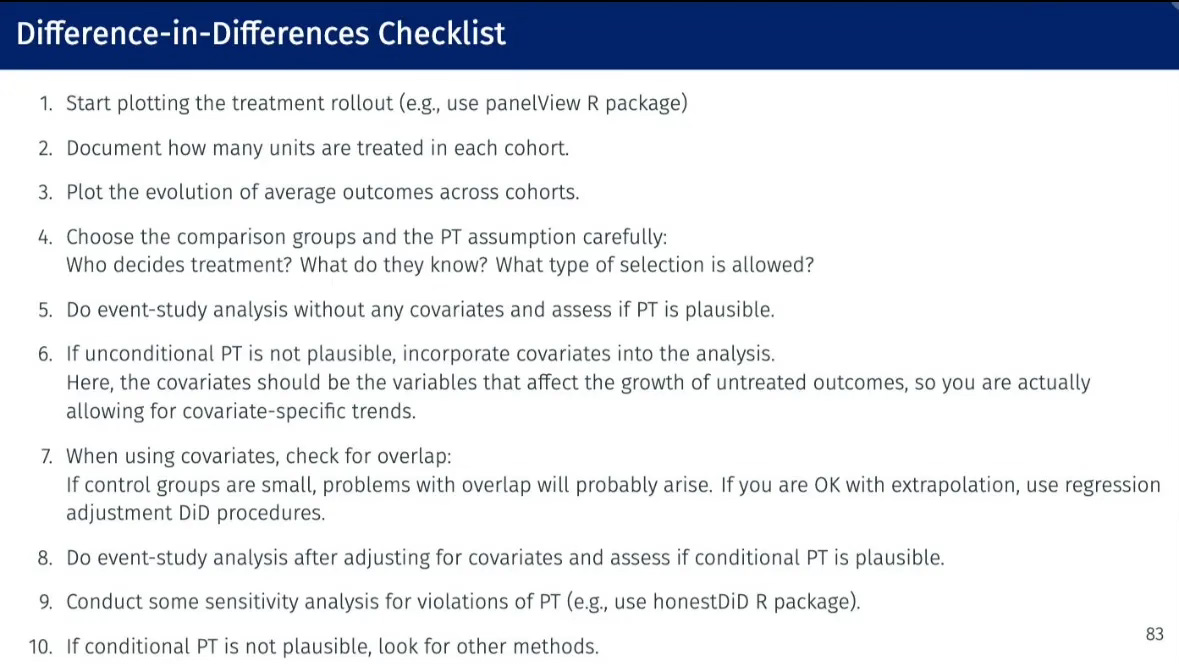
Step 2: Document how many units are treated in each cohort
Now, we turn our focus back to step two of Pedro’s checklist to document how many states are treated in each treatment cohort. That means counting. It should be something easy for you to count without error, but just as importantly, something for your reader to count without error as well. I’m going to go through two ways to do it: using a figure and using a table.
Counting Units per Cohort by Visualizing the Treatment Rollout
We could create a figure that shows the number of states treated in each year. This visualization could take the form of a line graph or bar chart, providing a clear visual representation of the treatment rollout over time. Such a figure would allow us to easily observe trends and patterns in the adoption of concealed carry laws across states from 1970 to 2007. There are 50 states plus the District of Columbia giving us 51 panel units over 38 years or a sample size of 1,938 observations. I strongly encourage you to count your panel units, count your total time periods, and multiply and check against your sample size. If it does not equal NxT, then just confirm why and whether to proceed.
Using the PanelView command by Xu, et al. (2023), I plotted the rollout (Step 1) just so we could see what we are working with here. There are three colors on here: the light blue listed at the bottom are our “Never treated states”. Everything above that is our treated states. The medium blue marks a treatment state’s pre-treatment years where it not yet been treated for those years, and the dark blue marks a treatment state’s post treatment years.
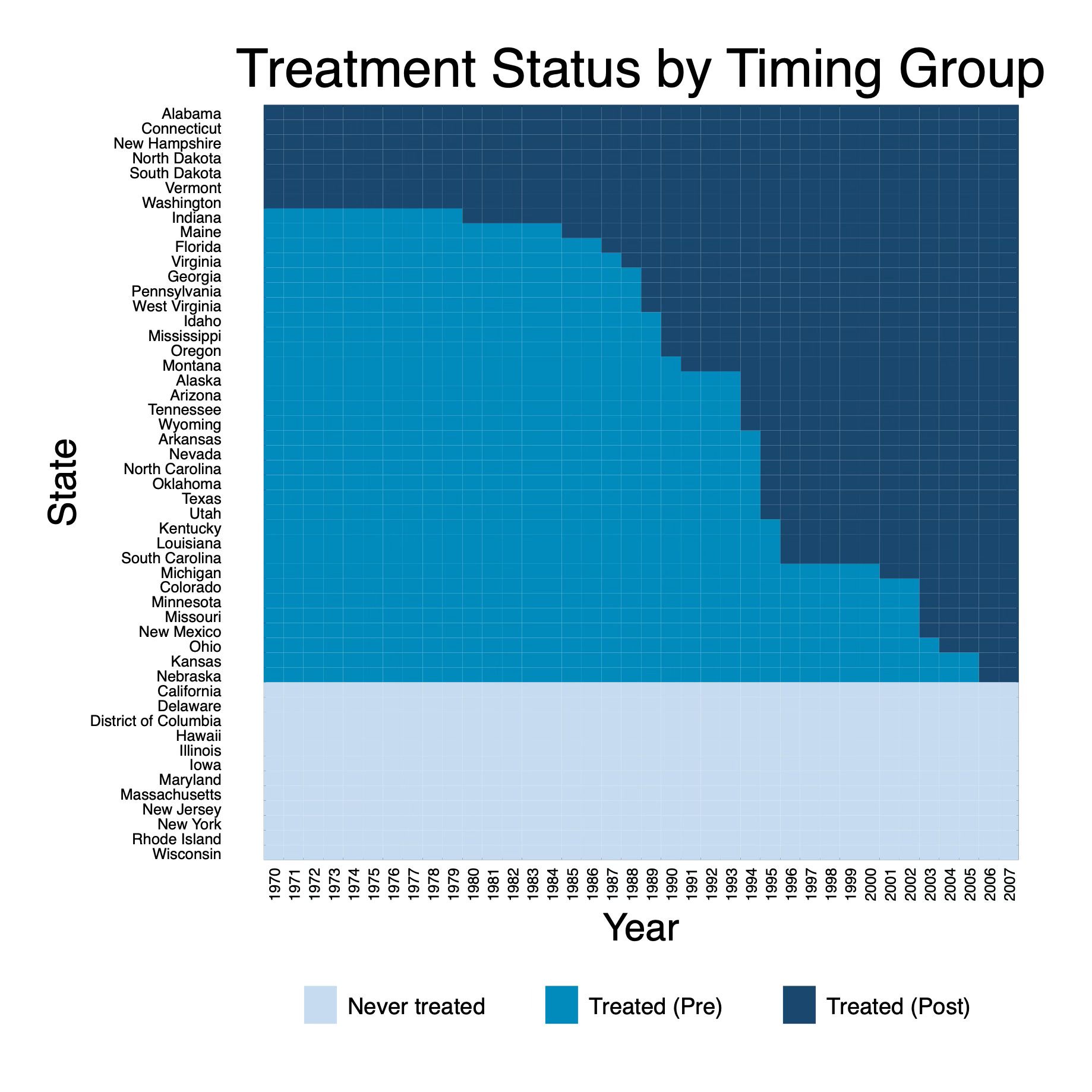
We can see from this graph that there are several states who were always treated in our panel. I know this because being treated is marked with dark blue cell, and there are 7 states at the top (Alabama, Connecticut, etc.) that only have dark blue cells. These are both states treated before 1970 and states treated in 1970, but for our analysis, it doesn’t matter when — only that they were always treated starting in 1970.
I also have several groups that will get treated over the course of the panel. Those are my medium blue states and the start with Indiana who gets treated in 1980. And then there are my never treated. They are the ones at the bottom in light blue. They start with California, Delaware, etc.
This graph is nice, and it’s the same one, more or less, that we used for Step 1 called “Visualizing the Rollout”, but using this figure to count the number of units by treatment cohort is not as easy as I thought it would be. For instance, count how many states are in the 1995 group using this figure.
It’s obviously possible, but to do it, you have to follow a series of steps. You have to take your finger, probably, or a pencil and go to 1995 on the x-axis (“Year”), then go up until you hit the dark blue colors, because the dark blue colors are the treated states. But there are a lot of dark blue cells above 1995 including states treated before 1995. Which ones then are only in the 1995 cohort?
To find that, you have to look at the 1994 list and then find all the medium blue colors in 1994 that switched to dark blue in 1995. Doing that, we can see that there are five medium blue squares in 1994 that switch to dark blue in 1995 and they are Arkansas, Nevada, North Carolina, Oklahoma, Texas, and Utah.
That is unnecessarily prone to error, either by the author, but particularly the reader. You’re asking them to count in two to three steps using pictures, and if they’re either color blind or they print in black and white, or God forbid their printer is sketchy and running out of the ink, it’ll be a mystery. So while this visual satisfies Step 1 of Pedro’s list, I think it doesn’t satisfy Step 2. For Step 2, I’m going to suggest using a table.
Tabulating the Treatment Rollout:
The alternative to the figure is a table that lists each cohort by year of treatment (including never treated) and then shows the states in that group so you can count it out. I’ll do it two ways: first with only the number of states in a cohort, then the names of those states separately. If you count, though, be sure you only do it for one year because you want the number of states in a given treatment cohort (N), not the total number of observations (NxT) in a cohort.
// Tabulate treat_date for the year 1970
tabulate treat_date if year == 1970, matcell(freq) matrow(names)
Then make a table based on that output however you want. For those wanting a quick LaTeX table, just load the output into ChatGPT-4o with instructions of what you want (how many columns, title, what you’ll put in bold and what you won’t, etc.). Copying and pasting the output from the tabulation with simple instructions got me this table in a matter of seconds using ChatGPT-4o. But don’t do this for the final product, as your goal is always to automate the creation of this table so that it is replicable, and so as to avoid mistakes, as ChatGPT-4o, bless his heart, sometimes dreams things that aren’t there (join the club). Consider Julian Reif’s texsave command for automating your LaTeX tables or possibly Ben Jann’s est suite of commands.
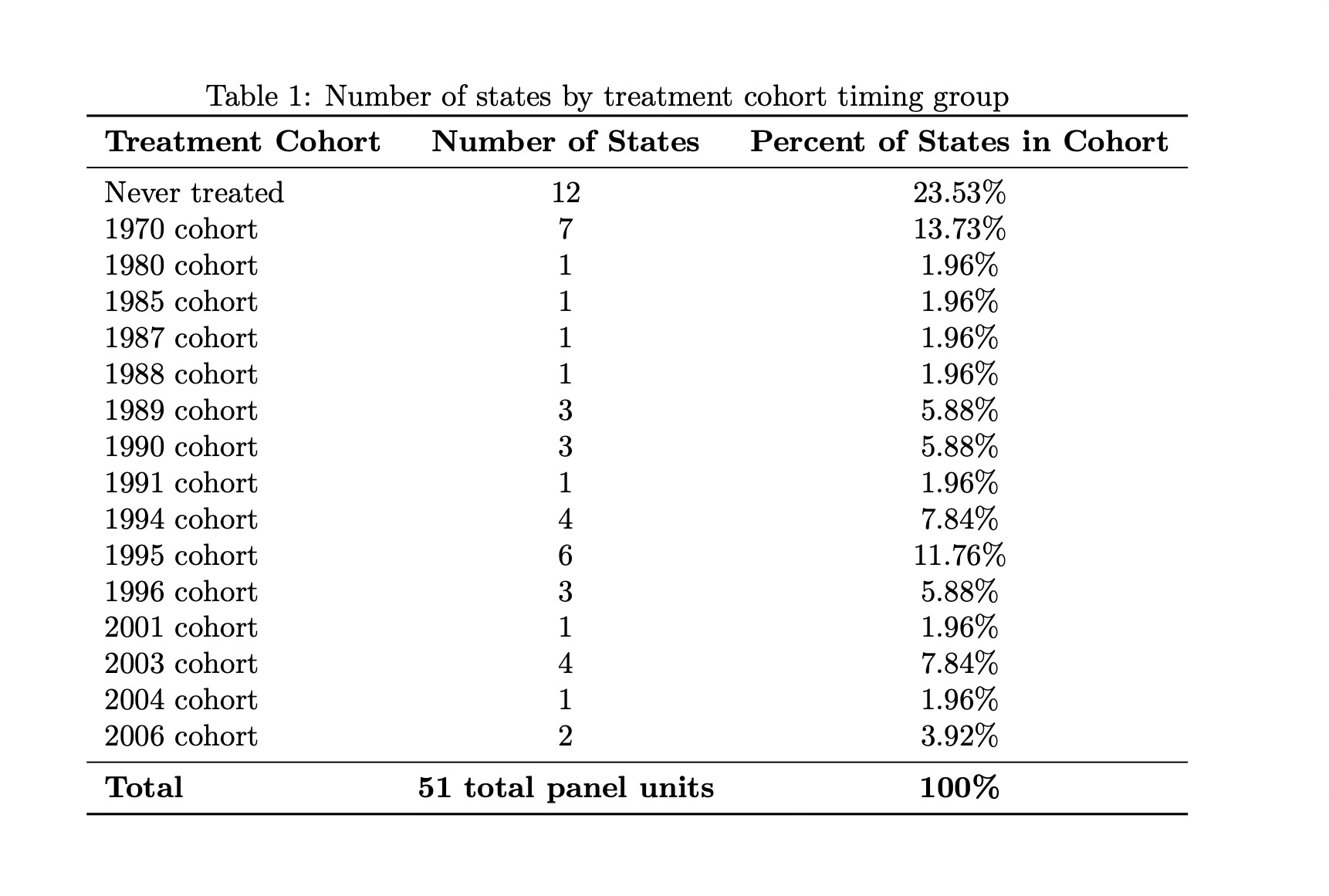
But using I am not crazy about this though because while it counts the number of states in a cohort, it does not display their names. And probably displaying the names, or at least the abbreviations, would let you do this just as easily both see who was in the cohort and then count how many. So again, here’s what I did to get the names of the states.
* Get state names by treat_date for the year 1970
levelsof treat_date, local(treat_dates)

foreach x in `treat_dates' {
    display "Treatment date: `x'"
    tabulate state if treat_date == `x'
}

* Copy output and give it to ChatGPT-4o to make a pretty table for us in LaTeX as I'm too lazy to do it here.
Unfortunately, these data don’t have a variable called “abbreviation”. So I’d have to create one myself, and probably I’d just ask Cosmos (“ChatGPT-4o”) to do it for me, but I didn’t here. Instead I ran the above, posted the output into Cosmos, gave him the old table he’d made me, and asked him to switch out column 2 with the abbreviations of the state names that my code above gave me, and he did bless his heart.
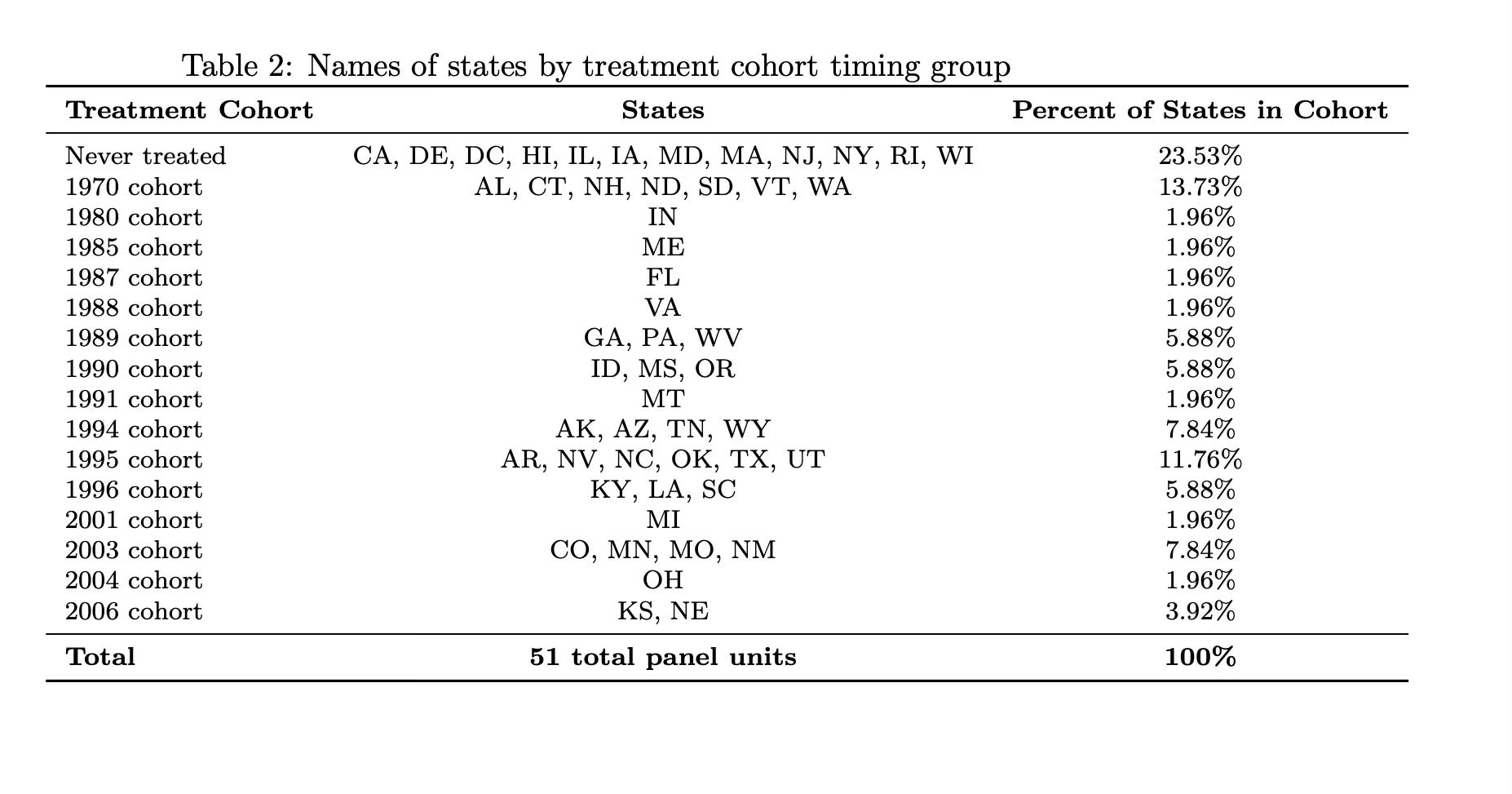
Yea, that’s more like it. It’s a lot easier to count out the states now for 1995, as well as the large groups like my never treated group. I can now more easily see that I have 12 states in my never treated group — California, Delaware, DC, etc… — compared to using the rollout figure.
I think these are complements to one another, and in some ways Table 2 does both step 1 and 2 combined, but I think doing them separate is smart. First because the checklist has 10 steps, and that’s step 1. If we combined step 1 and step 2, it’s 9 steps. Whoever heard of a checklist with only 9 steps. Second, Pedro said to do to this, so that’s another reason. And third, I think we underestimate the power of pictures to convey information over a table, but in this case, we may also underestimate the power of the table. So I say both.
Conclusion
I thought about combining in this substack steps 2 and 3, but decided against it. This was plenty. And now I’m done. I’m going to post this on a Sunday, which I don’t ordinarily do, but I’m going to. I’ve got to now pack for Bologna, because tomorrow I’m presenting at the University of Bologna my paper with my colleague Van Pham on forecasting macroeconomic variables using ChatGPT-3.5 and ChatGPT-4. We have a new set of results that we are calling “post script” that are additional falsifications. So wish me luck. I still get nervous presenting this paper as it is so weird, but I was pleased to learn that it has already been cited a few times, and the methodological concept used by a few teams. I hope to have our draft updated soon, and then I’ll share those results, as well as describe what we are doing next on this topic of using large language models to forecast out of sample using only its internal training data without any embedding or fine tuning.
In the meantime, happy father’s day to all those fathers out there, and happy father’s day to all those who want to be fathers but are not yet ones. As a good friend once told me, there is no future, only infinite possibilities. There is only now. So have a great day.
Thank you so much for this detailed explanation. Happy father’s day Scott.
Thank you Scott, very helpful.