


Step (3) in Pedro’s diff-in-diff checklist: plotting the outcome
Step (3) in Pedro’s diff-in-diff checklist: plotting the outcome

This is the third Substack post on “Pedro’s diff-in-diff checklist,” a 10-step checklist Pedro Sant’Anna proposed in a recent talk he gave at Amazon. I have been going through each step one at a time to illustrate possible interpretations and implementations of the checklist so that even if you disagree with my interpretation and implementation, you’ll have something simple to react to, helping spur you towards what you think is a better interpretation/implementation. Step 1, on plotting the rollout by timing group, was here. Step 2, on counting the number of units in each timing group, was here. Today, step 3, is about plotting the evolution of the average outcomes across cohorts.
Concealed carry data
Before we get going, I’m going to just re-introduce the dataset. The data I’ll be using is a state level panel data on crime and concealed carry laws from Aneja, Donohue and Zhang (2011). The name of the article that used these data is “The Impact of Right-to-Carry Laws and the NRC Report: Lessons for the Empirical Evaluation of Law and Policy” published in the 2011 American Law and Economics Review. As I said in an earlier substack, I’ve uploaded these data to my GitHub repo to make them easier to download in the code that I use for this substack.
These data do not contain a “treatment date” variable, so we have to make one. And that is because with differential timing, we have to have a group variable and what makes a panel unit a group is which time period it was treated, assuming it was treated at all. You will want to change the “cd “/users/scunning…” to your own directory or delete it altogether. The only reason I have it there is because I will be making figures and wanting to put that in a single directory. But for this exercise, it’s not important.
* step 3: plotting the outcomes by timing group (cohort)

clear all
capture log close

cd "/Users/scunning/Library/CloudStorage/Dropbox-MixtapeConsulting/scott cunningham/0.1 Mixtape Consulting/Substack/Code"

use https://github.com/scunning1975/mixtape/raw/master/concealed_carry_state.dta, clear

* Load packages needed for panelView
* net install grc1leg, from(http://www.stata.com/users/vwiggins) replace
* net install gr0075, from(http://www.stata-journal.com/software/sj18-4) replace
* ssc install labutil, replace
* ssc install sencode, replace
* cap ado uninstall panelview //in-case already installed
* net install panelview, all replace from("https://yiqingxu.org/packages/panelview_stata")

* Generate a treatment date variable
gen     treat_date = 2020 	// never treated
replace treat_date = 1970 if shalll==1 & aftr==0 // always treated
replace treat_date = 1994 if fipsstat==2 		 // treatment cohorts
replace treat_date = 1994 if fipsstat==4
replace treat_date = 1995 if fipsstat==5
replace treat_date = 2003 if fipsstat==8
replace treat_date = 1987 if fipsstat==12
replace treat_date = 1989 if fipsstat==13
replace treat_date = 1990 if fipsstat==16
replace treat_date = 1980 if fipsstat==18
replace treat_date = 2006 if fipsstat==20
replace treat_date = 1996 if fipsstat==21
replace treat_date = 1996 if fipsstat==22
replace treat_date = 1985 if fipsstat==23
replace treat_date = 2001 if fipsstat==26
replace treat_date = 2003 if fipsstat==27
replace treat_date = 1990 if fipsstat==28
replace treat_date = 2003 if fipsstat==29
replace treat_date = 1991 if fipsstat==30
replace treat_date = 2006 if fipsstat==31
replace treat_date = 1995 if fipsstat==32
replace treat_date = 2003 if fipsstat==35
replace treat_date = 1995 if fipsstat==37
replace treat_date = 2004 if fipsstat==39
replace treat_date = 1995 if fipsstat==40
replace treat_date = 1990 if fipsstat==41
replace treat_date = 1989 if fipsstat==42
replace treat_date = 1996 if fipsstat==45
replace treat_date = 1994 if fipsstat==47
replace treat_date = 1995 if fipsstat==48
replace treat_date = 1995 if fipsstat==49
replace treat_date = 1988 if fipsstat==51
replace treat_date = 1989 if fipsstat==54
replace treat_date = 1994 if fipsstat==56

// Define the labels for each unique value
label define treat_date_lbl 2020 "never treated" ///
                      1970 "always treated" ///
                      1980 "1980 cohort" ///
                      1985 "1985 cohort" ///
                      1987 "1987 cohort" ///
                      1988 "1988 cohort" ///
                      1989 "1989 cohort" ///
                      1990 "1990 cohort" ///
                      1991 "1991 cohort" ///
                      1994 "1994 cohort" ///
                      1995 "1995 cohort" ///
                      1996 "1996 cohort" ///
                      2001 "2001 cohort" ///
                      2003 "2003 cohort" ///
                      2004 "2004 cohort" ///
                      2006 "2006 cohort"

// Assign the labels to the treat_date variable
label values treat_date treat_date_lbl

drop if state==""
encode state, gen(id)

gen treat = 0
replace treat=1 if year>=treat_date
Horror films and data visualization
Not everyone has the same reaction to figures when those figures do not follow known forms. And when you’re working on a project, as everyone reading this knows, you can become so close to something that you can find some picture that perfectly conveys the ideas you want to convey. We all know what an event study is, so when we see one, our mind fills in all the questions a person who’s never seen one before would have. A lot of things are like this. In a horror movie, for instance, if one of the characters goes into the garage to check on a noise, if you’re a student of the genre, you know you’ll never see that person alive again. It’s the same with data visualization. There are some forms we already know so that when we see it, our mind knows immediately what we are seeing, what it means, and what are the signs to look for.
That’s just something to always carry in the back of your mind. Some forms of data visualization your audience already knows, and some forms they don’t, and how you communicate when someone knows the form deeply ahead of time is likely to be different when they don’t. That’s why I tried a few different things in this exercise. I kept asking myself “if a stranger saw this, what would they say?” And my gut said that since I was plotting the outcome separately for each timing group, and given that isn’t always done historically with differential timing, though interesting Cheng and Hoekstra (2013) did do that, then I suspected there were going to be some subtle details that I needed to be attentive to otherwise I could lose them. And what I decided was that the subtle details that could hurt me here was in showing so many outcomes at the same time at different time periods in an overlay plot.
The overlay plot is one I do not like a lot because of the issue with how someone will be able to carefully discern whose line is who. The more lines there are, the easier it is to be confused by whose line is whose, the easier it is to think lines are connected when they aren’t. The overlay plot rarely seems like more than a bunch of spaghetti thrown against the wall. So I tend to not have a good experience when I see it. I ended up feeling embarrassed even, which I shouldn’t feel but that’s a conversation for my therapist, because I really just want the speaker or the writer to walk me through each element of the figure. But rarely do they.
The alternative is not much better though. In Cheng and Hoekstra (2013), the authors had a differential timing scenario an 11-year state panel of 51 panel units. There were five treatment dates: 2005, 2006, 2007, 2008 and 2009. So they created five separate graphs. And that was to me ideal, except for one detail which was it created five separate exhibits. And given some journals have a limit on how many exhibits you can have — like AER: Insights where each additional “exhibit” (table or figure) reduces the maximum allowable words by 200 — then it may be prohibitive to do this. Otherwise to accommodate the space constraints, you end up sticking it into an appendix which I get the sense is not a good approach here as we want the reader to see the outcomes evolving over the course of the panel.
Plotting the individual panel units and marking pre and post with colors
Now technically Pedro’s third step is called “Plot the evolution of average outcomes across cohorts”. But that word “average” could be something that someone new to the differential timing literature maybe didn’t catch, so I want to do two things first. First, I want to plot individual outcomes and use colors or other markers to identify which cohort a unit belongs to. I wanted to do this because it is not uncommon to see it, and I wanted to offer my own comments about that. But the second reason I wanted to do this first was so that I could explain why Pedro’s checklist says to focus on averages, not individual panel unit outcomes, and that is because difference-in-differences uses averages for estimation.
In a panel, we are used to thinking in terms of individual unit variation. That’s because the panel consists of units. So one option I’ve seen is a person will plot each individual panel unit’s outcome since they assume that given it’s a panel, it would make sense to visualize the panel elements. Here I’ll use Yiqing Xu’s excellent panelView (available in both Stata and R) as we have been doing. But you may have another way you’d like to do it.
* Plotting outcomes by treatment cohort include always treated
panelview lmur treat, prepost  i(state) t(year) type(outcome) title("Log Murder by Panel Unit") legend(label(1 "Never treated") label(2 "Treated (Pre)") label(3 "Treated (Post)"))  // type(outcome) & number of treatment level = 1: same as ignoretreat

graph export "./plotting_outcomes.png", as(png) name("Graph") replace
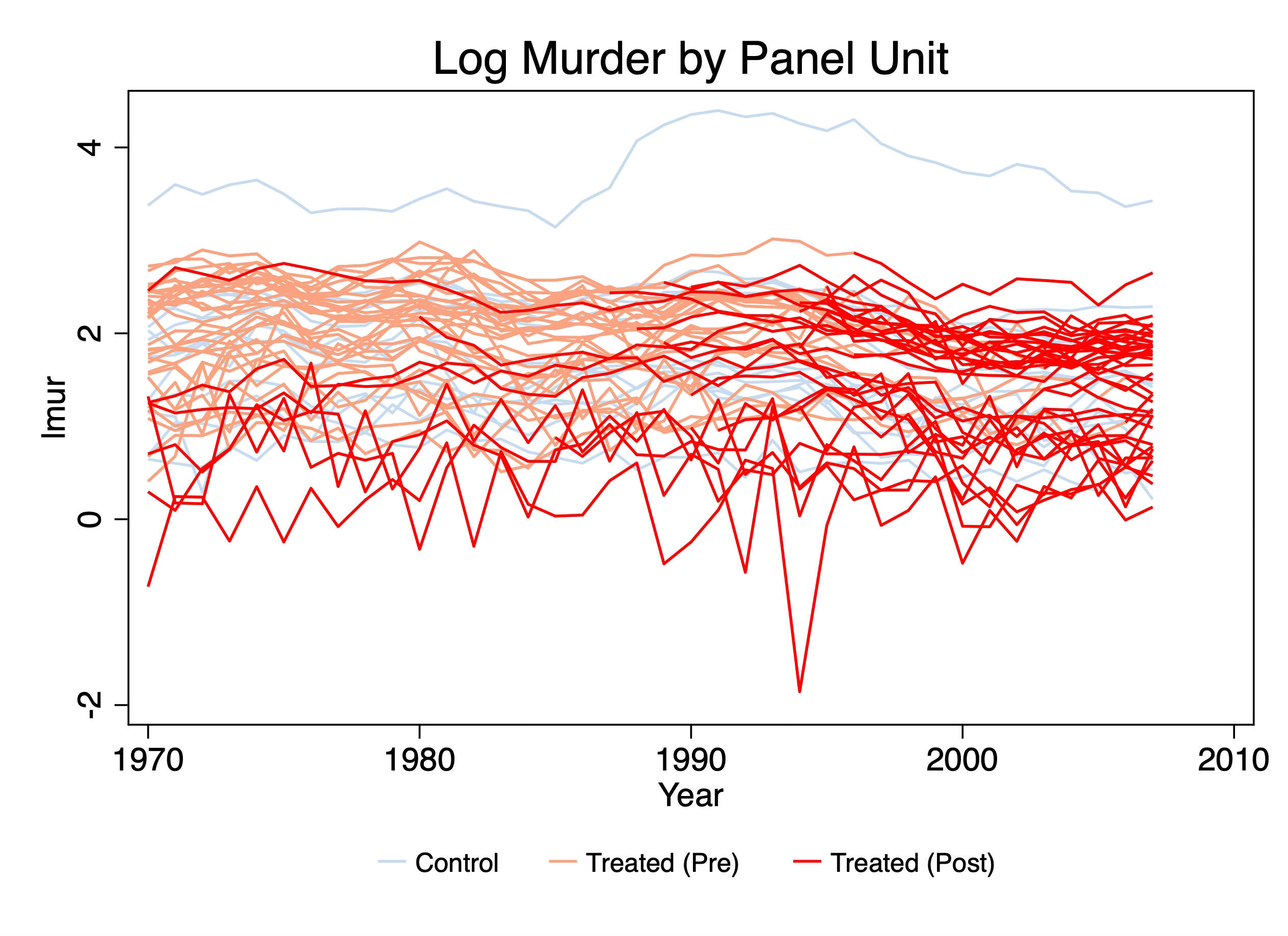
Putting aside the fact that Pedro said to plot the averages for a moment, and putting aside my point about diff-in-diff using averages, I wanted to say that figures like this are very hard for me to understand. In fact, I find this plot incomprehensible. It’s a plot of spaghetti noodles and not the good kind. It attempts to show each state’s time path and mark the switches by going from pink to red, and then show our never treated in light blue, but because they are all so close together, and there’s literally 51 lines on here, I don’t know where to start, or what to take away from this. It’s information overload and I worry that this is what is done when someone doesn’t really have a plan for what they hope to accomplish with their data visualization or what pieces of information they are hoping the reader takes away from it.
But the incomprehensibility isn’t the only reason I don’t like this. The other has to do with the fact that it misrepresenting the variation that’s used to estimate the average treatment effects with difference-in-differences. Difference-in-differences, despite using panel data, does not use individual variation in the panel unit outcome, at least not directly, to calculate treatment effects. Rather it uses average outcomes per timing group and then pushes them through the simple “two by two” difference-in-difference equations which recall are versions of this:
where “2x2” is simply the more recent nomenclature for the four averages and three subtraction equation on the right. Whether we estimate did models with TWFE or some other methodology, the core equation is the 2x2. TWFE takes a weighted average over all possible 2x2s in the data for its estimate, and robust diff-in-diff methods use a different weighting scheme and only a subset of all possible 2x2s.1 Point is, though, the calculate of the coefficient comes through those means, so we should therefore in my opinion plot, not the panel unit outcomes, but the mean outcomes associated the first part of that equation — the treatment group in question. In a later step of Pedro’s checklist, we will focus on the selection of the appropriate comparison group, so for now I’m not going to create my figures with any control group overlay. Instead I’m going to just focus on plotting the mean outcomes per timing group because if you look closely at Pedro’s name for step 3, it had said to plot the average outcome’s evolution per timing group, not the individual.
Plotting the average outcomes in an overlay
What this means is that if you have 51 panel units, you don’t show 51 figures. Rather you show the mean outcomes per cohort because in diff in diff you will be calculating your final parameter estimate using the means per cohort. Everything I say is my opinion, not the truth, so feel free to disagree, but is my reasoning given my effort to match the visualization with the estimation and identification itself. Show the average outcomes, in other words, evolving per each timing group. Let’s now look at an overlay plot and then look at the figure that combines them. Then I’ll just offer up my reaction, but feel free to share your honest reaction. I know how I react and how most people react is often very different so it’s highly possible I’m off base and the overlay is better. I’ll use Stata’s -xtline- command for this part, but notice first before I run it, I use -collapse (mean) lmur- so that I can get average outcomes like Pedro’s checklist said to do in step 3.
* Just use collapse for now
preserve
collapse (mean) lmur, by(treat_date year)
xtset treat_date year
xtline lmur, overlay plot1opts(lcolor(black) lpattern(solid)) plot2opts(lcolor(green) lpattern(dash)) plot3opts(lcolor(cyan) lpattern(dot)) plot4opts(lcolor(blue) lpattern(tight_dot)) plot5opts(lcolor(magenta) lpattern(longdash)) plot6opts(lcolor(cranberry) lpattern(vshortdash)) plot7opts(lcolor(pink) lpattern(shortdash)) plot8opts(lcolor(sandb) lpattern(shortdash_dot_dot)) title("Plotting average log murders by year") subtitle("Each line is a treatment cohort timing group")

graph export "./xtline_outcomes.png", as(png) name("Graph") replace
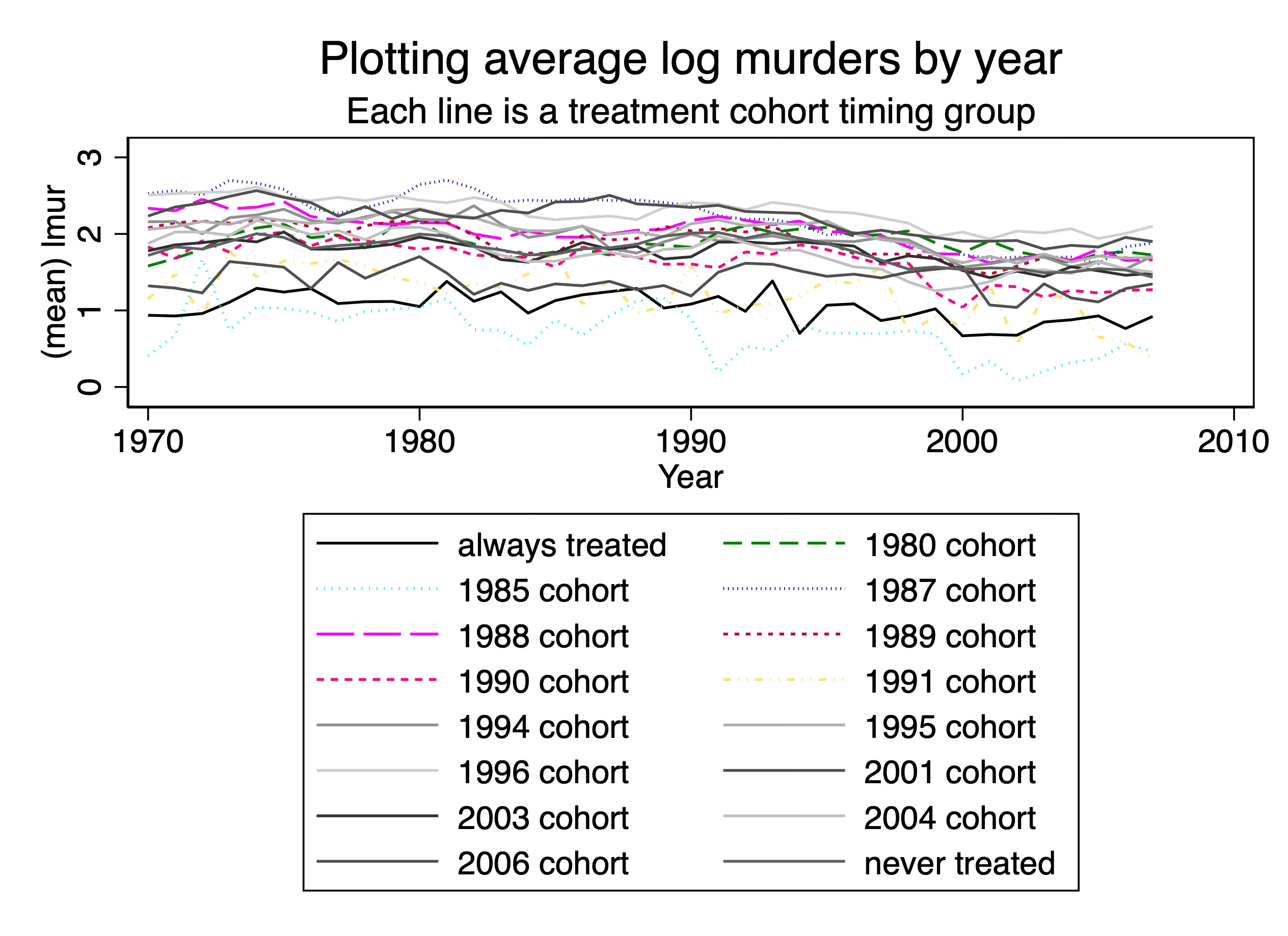
First, what’s new? Well, one thing I did differently was I averaged. As we showed in step 2, these data have 16 timing groups, which means I will have to construct 16 average outcomes in a time series and plot them. I took the mean of the logged outcome for one simple reason and that is that if I am working with logged murder, then diff-in-diff will be taking the average. So rather than average murders in levels and then logging, you need to take the average of the log because that’s what your method will be doing in the end. So that’s one novelty.
But the second is that I used a legend, whereas in panelView I didn’t. But now the legend takes up more than half the height of the figure and for no other reason than to tell how which line is which in the picture. It seems like it’s a conceptual error to have a figure of data where most of the figure isn’t the data.
And last, so that I would avoid the problem of using colors only to mark a line, thinking carefully about the audience who may be looking at this figure in black and white or may be color blind, I tried to use as many different ways to mark a cohort as I could, but I basically apparently ran out of steam because I just noticed I never finished doing it. But I don’t think honestly it would’ve mattered because Stata’s line plots using dashes and dots really starts to become fairly useless, in my experience, for every other way of displaying lines except for the connected line and the dashed lines. Even the dots and the short dash-long dash options start to really break down. In my experience everything except for simple dash is hard to decipher.
But then there is just the overlay itself. I think we are running into the same problem that we saw with the panelView option I used above which is I don’t think overlay is as helpful to convey separate pieces of information — at least not for how my brain works — as people think. So I’m going to try one more thing.
Create separate figures then combine
The one more thing I’m going to do, which will be my preferred way, is to create 16 separate figures, each consisting of one time series of average outcomes, and then combine them.
// Just to remind you we are using the mean outcome per timing group
collapse (mean) lmur, by(treat_date year)
xtset treat_date year


// Create individual plots with reference lines
foreach t in 2020 1970 1980 1985 1987 1988 1989 1990 1991 1994 1995 1996 2001 2003 2004 2006 {
    local label = cond(`t' == 2020, "never treated", "`t' cohort")
    local rline = cond(`t' == 0, 0, `t')

    twoway (line lmur year if treat_date == `t', lcolor(blue) lwidth(medium)) ///
           , ///
           subtitle("`label'") ///
           name(plot_`t', replace) ///
           xline(`rline', lcolor(red) lpattern(dash))
}

// Combine the individual plots into a single graph
graph combine plot_2020 plot_1970 plot_1980 plot_1985 plot_1987 plot_1988 plot_1989 plot_1990 plot_1991 plot_1994 plot_1995 plot_1996 plot_2001 plot_2003 plot_2004 plot_2006, ///
    title("Combined Plots of Average Log Murders by Treatment Cohort")

graph export "./combined_outcomes.png", as(png) name("Graph") replace
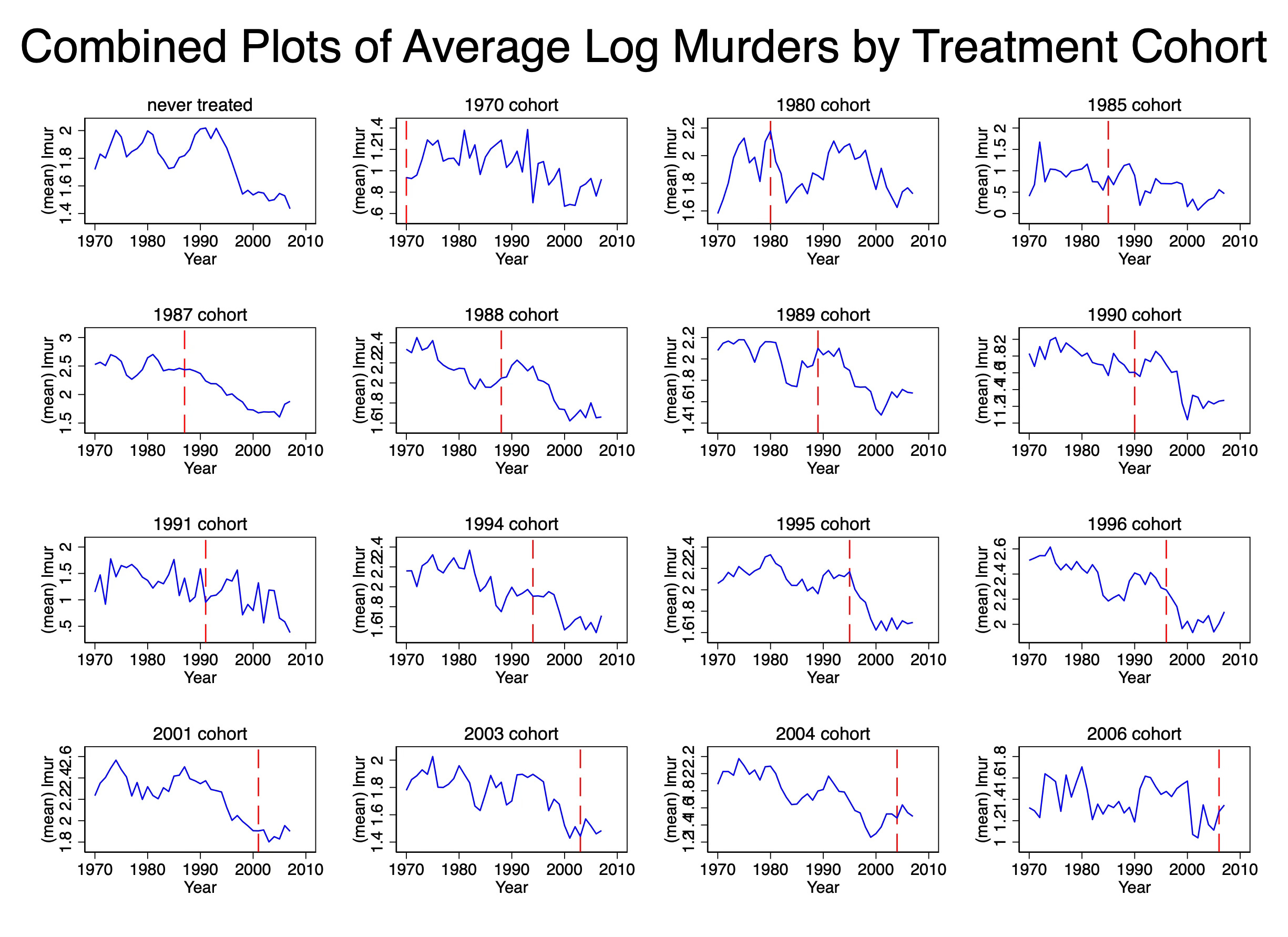
First let me tell you what I don’t like about this picture, then I’ll tell you what I do like. The y-axis scales are changing from figure to figure. But it’s a little hard to see that unless you look closely. The never treated cohort tops at a log of 2. But the 1970 cohort tops at a log of 2.4. The 1996 cohort tops at a log of 2.6 and the 1987 cohort tops at a log of 3. The 2006 cohort, on the other hand, tops at a log of 1.8.
These aren’t ultimately huge numbers, but as they are logs, they represent large numbers in underlying levels. So that’s something for you just to remember as you think about the presentation. And many people feel that you have to be careful when presenting time series where the figures have shifting y-axis scales.
But now what do I like about this? First, now I can finally focus on each average outcome separately, rather than trying to untie the Gordian knot of plots, individual or average, in the overlay plots. Particular plots now stand out starkly. The 1995 cohort, for instance, after concealed carry is passed sees a dramatic decline in log murders, but the 1991 cohort sees an uptick after its was passed.
I can also see that the never treated cohort is, well, never treated because there is not vertical dashed line on that figure. Which is another reason I like the separated figures — the separated figures allow me to add the vertical line so that I can see precisely when each cohort was treated. Now by virtue of the fact that something is called “never treated” I should know it wouldn’t ever get a vertical dashed line, but see, this gets back to my earlier point — many people may not have the latent knowledge of this because this step is not something that is explicitly required. So if the data visualization has not become a genre, then we can’t just take a lot of little things for granted, and in my opinion, that’s when we have to use some additional labels to help the reader not come to the wrong conclusion. Similarly, we can see that the 1970 cohort is always treated.
In this case, my preference is the second one. It allows me to place a separate vertical axis on each sub-figure. It allows me to scrutinize just each figure. It allows me to take my time. And best of all, because they’re separated unlike the overlay, I don’t end up with multiple sources of information competing for my eyes and attention. Some figures might be very interesting showing very surprising trends, but others may not, and by avoiding the overlay, maybe I can’t focus more intently on each one and attach that pattern with the correct cohort.
Conclusion
So the key things, to conclude, are this. First, remember that the estimation of diff in diff works with mean outcomes, not unit outcomes, so whatever you do, focus on means. You’ll need to generate the means since your data will only be in panel units. Second, just keep in mind that there’s what you know about your data and what your audience knows. Remember that the things the audience knows are genre elements — just like the audience knows what happens to characters when they go check out a sound in the basement, your readers and audience know what certain plots mean and what they are for, and others are brand new. When they are brand new, they aren’t part of an established genre, and when they aren’t part of an established genre, there’s both opportunities and potential hazards for conveying that information to people. Opportunity in that you aren’t as wedded to a particular picture format. Potential hazard in that you may have trouble finding a simple and maximally effective format.
It’s my opinion the overlay isn’t the maximally effective format because it in my mind defeats the purpose of this step. We do this step presumably not just to fly right past it but rather to slow ourselves and others down. We do it to see what happens in each timing group, because it is within the timing group that we will be calculating means and comparing with our untreated groups.
Imputation methods approach it differently, but get at the same place.