


I wrote this post last week. And a few days after I published it, Jason Fletcher left a comment that I couldn’t ignore. Gorkem Turgut (G.T.) Ozer had also said it to me, but I couldn’t hear it when he said it for some reason. Probably having both Jason and him say it to me was what made me start thinking about it. And then I couldn’t stop thinking about it and thus could not ignore it, as I couldn’t understand why his question would matter. He asked me about the heaping at the constructed t-statistic of 1 and 3, and just 2.
“Can you say something about rounding vs. p-hacking? What do you make of the huge spike at t-stat=1 in your first figure?”
I read it and just could tell he knew something I didn’t know, so after spending about five hours, like I said, on Sunday night going back and forth, shipping more and more things to OpenAI for analysis, I feel confident I need to post this now, as I don’t want to add noise to what David Yanagizawa-Drott is doing at the Social Catalyst Lab and their APE project.
What I Was Trying to Do
Let me start by explaining what I was doing in the first place. The last post was about the Social Catalyst Lab’s APE project. As of this writing, there’s around 750 papers, but when I pulled it last week, it was 651 economics papers written entirely by AI agents. David has said that his team will stop at 1,000, and then they are going to do p-hacking analysis on it (which I didn’t realize else I probably wouldn’t have written it up at all).
So as I said, I used Claude Code to ship 651 manuscripts to GPT-4o at OpenAI and extract coefficients and standard errors from the results tables. I did this for pretty simple reasons: because usually economists don’t report t-statistics. They report coefficients and standard errors. The t-statistic is their ratio, so having both of them (in my mind) shouldn’t matter. And in my mind, anyway, all I could see was the Brodeur, et al. histogram with a big heap at 1.96, and since I would be getting a t-statistic, I should be able to check what he did.
So, I got it. It took maybe less than 5 minutes for OpenAI to analyze 3500 regressions stored in tables and extract those coefficients and standard errors. I then divided them to get t-statistics, plotted the distribution, and when I noticed what looked like bunching just above t = 1.96, I became focused on trying to figure out where it was, and if it was. It for sure was, and so I just tried to describe it all even though I absolutely could not figure out how it was even possible that it would be there.
I called it evidence of p-hacking. I even cited a Brodeur ratio of 1.52. That ratios in their work means 52% more t-stats just above the threshold than just below which is a large number. The original Brodeur et al. (2020) paper found ratios around 1.3-1.4 in top economics journals.
I’m not saying that Jason Fletcher and Gorkem spotted the problem immediately, so much as when they asked me a question which seemed like the kind of question someone asks when they are pretty familiar with this literature. But I ended up spending five hours working through it with Claude Code before I fully understood what had happened. And while I am not sure what David Yanagizawa-Drott is going to find, I am definitely sure that you cannot go about this the way I did, because of the fact that the AI writers, like human writers, are rounding their regression coefficients and standard errors, which given the units in these outcomes, and the nature of the treatment, means that rounding will typically happen at the trailing digits in ways that guarantee a compression to some interval.
What Rounding Does to a Ratio
This is the part I hadn’t thought through. And frankly, now I’ll probably never unlearn it. But this was ironically part of the thing I was trying to study in the first place which was the rhetoric of AI written papers.
When an author rounds a coefficient to, say, three decimal places and rounds the standard error to three decimal places, both numbers become discrete. They’re no longer continuous. And since they are no longer continuous, then they are no longer unique. Anyone with coefficients and standard errors “near each other”, for whom neither had exactly the same coefficients and exactly the same standard error will have exactly the same both. That’s because the probability any two units have the same continuous value is zero but the probability that any two units have the same discrete value is not zero, or does not have to be zero.
So, when you divide two discrete numbers, the result is also discrete as it’s a ratio of two integers after that rounding. So even though you aren’t rounding the t-statistic, you rounded the inputs which then made the t-statistic shift away from its true value. Consider this example.
The coefficient is 3.521 and the standard error is 2.109. The t-statistic is 1.6695116169. But if you round to the hundredths, you get 3.52 and 2.11, which is 1.6682464455. Okay not much different.
But what if the coefficient is 0.035 and a standard error of 0.021. That ratio is 1.6666666667. But if you rounded to hundredths, that’s 0.04 and 0.02. And that is now 2.
So notice when the coefficient is “large” (most likely because the outcome units are also large), then rounding is inconsequential. But when the coefficients are “small” (most likely because the units of the outcome are small), then suddenly ratios can become 2 even thought the true statistic is considerably less (1.67).
In order for there to be a large number of t-statistics at 2 after rounding the inputs, there must be a large number of values near there in the first place. You need a large number of “almost 2s” or “close to 2s”, though frankly it can still very insignificant and just through rounding give the appearance otherwise. Which is probably why it is not the worst idea in the world to show asterisks. If you are going to round, which you will, then it probably is a good idea to put stars on there, as usually we don’t care about the actual value of the t-statistic, but rather it’s relative position to some critical value, like 1.96.
But then why would there be an unusually large number of regression coefficients and standard errors near 2? Because in labor economics, proportions, log outcomes, employment rates and so forth are very common. And that space of outcomes gives us small numbers when you’re working with mostly treatment indicators. If it’s a linear probability model, then coefficients must be relatively small, for instance. If the outcomes are scaled to per capita, that can bring it down. If the mean of the outcome is 5, then a regression cannot feasibly be a 1,527 change in its value. And if you take the log of income, that will shrink the values too.
Well, the space of small rounded integers has a lot of 2-to-1 pairs in it. Not because of anything suspicious, but because 2:1 is the simplest multiplicative relationship between small numbers. (I keep getting bit in the butt by things I don’t know about the properties of large numbers with computers and apparently small numbers too).
I think that is why the spike appeared at 2, not 1.96. Which did not fully register to me whatsoever, probably because I am a visual thinker, and so the visual was all I could see in my mind. But Jason and Gorkem noticed a spike 1 and 3, and for some reason in my mind, I said those were noise, but at 2, it was signal. Which is something I’m going to have to think about more — why I could form that framing so easily, I mean. Anyway, the point is rounding creates heaps at all simple integer ratios, from what I now understand, which is 1, 2, 3, 3/2, 5/2, and so on. The heap at 2 is the biggest one near the significance threshold because that is where the density of true t-stats is highest. There’s more raw material to collapse onto that value.
I’ll get more into this “that is where the density of true t-stats is highest” later, but first, here’s a simulation I had Claude Code make for me. It’s 3500 fake regression drawn from a completely smooth underlying distribution. No bunching, no manipulation, nothing. The left panel is the “true” distribution and the right panel is what you get when you extract the rounded (imprecisely reported in a paper iow) coefficients and SEs and then compute the t-statistic yourself by taking the ratio of those rounded values.
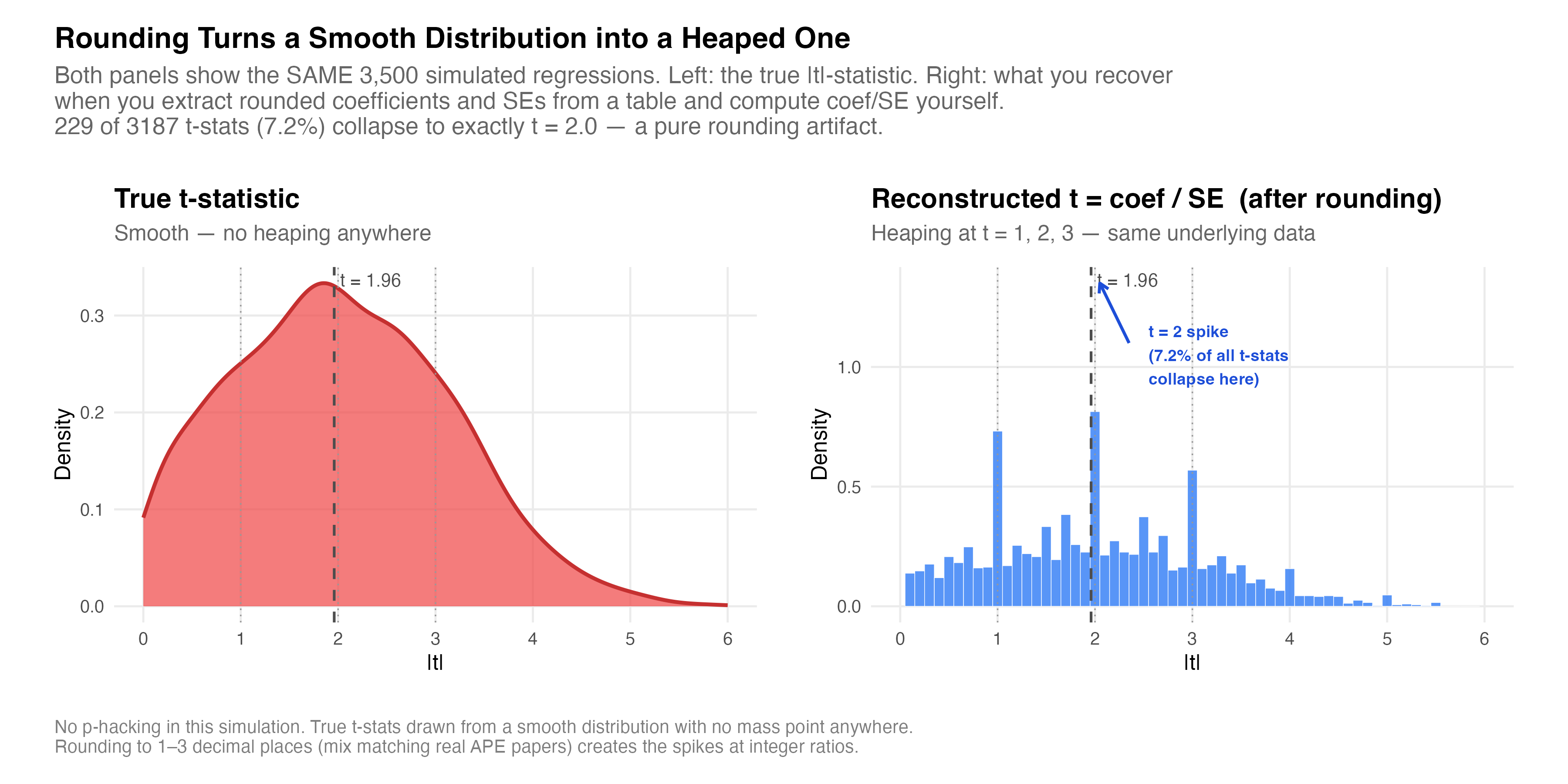
This isn’t the APE data; like I said, this is simulated. But it was done, at my request, to create values that were more likely in that vicinity. And what I got was 229 of 3,187 t-stats, which is 7.2%, collapse onto exactly t = 2.0. The underlying process has no mass point anywhere. The spike is purely a consequence of dividing two rounded numbers.
What kills me is I literally have never thought about this before. I don’t report t-statistics. I report coefficients, standard errors and p-values. More recently, I report confidence intervals. But I always have the software produce them for me using software packages. I only asked OpenAI to extract the coefficient and standard error because I knew I couldn’t get the t-statistic. But see the t-statistic is never based on the same kind of deeply coarsened set of numbers as I was doing.
But now it’s obvious. The rhetoric of human written papers is to round at some common set of numbers (e.g., hundredths), but then all statistics based on them are calculated using the non-rounded values. But I just had never thought about this because I had always put some weird script on statistic length like %9.2 or something to say “round to hundredths, let digits before be as large as 9 digits”.
What This Means for the Brodeur Test
The Brodeur et al. (2020) p-hacking test doesn’t use reported coefficients and standard errors from published papers to then compute t-statistics. Rather, they used the t-statistic from software output. Brodeur et al. were more careful about this than I had been. They extracted t-stats directly from regression tables that printed them, or converted reported p-values to z-scores. They specifically avoided reconstructing t-stats from rounded coefficients and standard errors precisely because of what I just described and that I have learned the hard way.
The test is to count t-statistics in a narrow window just below 1.96 and compares them to the window just above. It’s a type of RDD / bunching style approach to forensic science. Under the null, the distribution of t-statistics should be smooth around the critical value. There’s no reason for more mass above the threshold than below. But if there was such an asymmetry, specifically more just above than just below, it suggests something is nudging results across the line.
But, I don’t have the R code or the data; just the manuscripts. So everything I had was whatever made it into the LaTeX tables which means rounded coefficients and rounded standard errors. And because the papers do not consistently report t-statistics (or even p-values), then I just pulled the coefficients and standard errors thinking that was the same thing not even remotely remembering that %9.2 thing I mentioned, which is that I round constantly. I do it for display purposes.
Anyway, when I do a donut hole approach, and drop the 68 cases of exact 2s from the bunching window, the ratio drops from 1.52 to 1.02. In other words, it becomes flat, no bushing, suggesting that my original finding was entirely based on the extraction method I used. David will be looking at this soon, probably in a couple weeks, and my guess is that when he displays the raw t-statistic, there will not be any sign of p-hacking. Because my initial disbelief was probably warranted — it’s very hard to wrap one’s head around how it could happen realistically without just waving one’s hand with the “it’s in the training data” card.
What I Should Have Said
I’ll be honest. I think that graph completely took over my mind. I wasn’t intending to write about p-hacking; just rhetoric. I keep being interested in how humans write in science, and this idea that AI can extract those rhetorical principles, even when they are not written down. But when I saw that graphic, all I could see was p-hacking, when a couple of other readers immediately sensed that it was probably a mirage created by rounding the inputs in a ratio.
I guess it’s good I learned something new, and so I think others for pointing this out to me. I think it’s not so much that p-hacking doesn’t happen with AI agents - although frankly, I find it borderline impossible that it could happen, but if so that is absolutely a fascinating and important result, and may even be the app killer for the whole thing. If AI agent written papers are not p-hacking, then that is going to be a major result, and I look forward to reading David’s team’s paper on this. But they’ll have the real t-statistic to do it.
Amazing. Two things:
1. I was fascinated by your p-hacking piece and wanted to get back to finish it and try to get my head around it. And the confirmation bias was strong with me! "It's the training data." - yep, it's going to double down on our mistakes. For what it's worth, I'm still confident that AI will improperly interpret statistical significance because of all the bad training data out there (ex. The findings indicate "no effect", etc.). Maybe I should try to analyze that somehow. ANYWAY, the piece today is fantastic and such a great reminder about how we understand and practice precision.
2. This is coincidentally very related to something I'm working on with some coauthors. One of our outcomes has a fairly low mean-y, and the effect size is very small. At the bottom of each column in the table we report the approximate percent change from baseline, i.e. coefficient over mean-y. In general I like this statistic. However, we are in a debate about whether to report the percent change calculated in the software, which is not rounding these two numbers, or the percent change you get when you use the reported (rounded) numbers. We get whole numbers for many of them when we do this, as we are rounding to 3 decimal places and the effect size is usually less than 0.005. The reason for this is the same as what you were addressing, just less consequential because it's not the t-stat, just more of a contextual statistic. That said, I'm curious what you would do. ( I won't state my preference as I don't want to bias you.)
Bonus:
3. Very related: why don't we use the concept of rounding to significant digits instead of decimal places in econ tables? In science it's very clear that if numbers are smaller, you adjust the decimal places to get to a comparable reporting of precision. I have done this before, having more decimal places for a column with smaller effect sizes, but it seems to rock the boat.
Another great post. Very thought-provoking. I never thought about this rounding error-mode before.
I also really like your simulated empirical example. I'm wondering why you chose to compare a histogram to a smoothed density plot, in your figure, when the key distinction (I think) is that left-side results are rounded when right-side results are not). i.e., by comparing different plots, someone (not me--I'm fully persuaded by your argument) might wonder if the fact that right and left sides look really different is really due to the rounding/not-rounding, or due to the tuning parameter chosen for two different data-viz designs (each design being quite sensitive to tuning choice). I'm just wondering, if you were to compare two histograms with the same number of breaks, or two density plots with the same bw, is the visual impact much the same?