Why is TWFE biased in some event study graphs but not others? (with an Apple Vision Pro explainer at the end)

I’m going to in this substack review two contemporary event study figures. The first will be from an article published in the AER in 2022 entitled “Social Media and Mental Health” by Luca Braghieri, Ro’ee Levy, and Alexey Makarin. And the second will be a working paper by Erik Brynjolfsson, Danielle Li, and Lindsey R. Raymond entitled “Generative AI at Work”. Both articles produce what is now becoming standard in diff-in-diff papers with staggered adoption where somewhere there is a figure showing “all the event study plots” from approximately 5 different estimators: TWFE, and then usually Callaway and Sant’Anna, Sun and Abraham, Borusyak, et al. and de Chaisemartin and D’Haulftœille.
But in this substack, what I want to do is go through four steps related to comparing each paper’s version of that event study and help explain why sometimes TWFE yielded the same coefficient as the others and sometimes not. But I also wanted to show you me trying to explain this with a video of my new Apple Vision Pro where I basically have all the papers figures floating in the sky and can just put my arms directly through the event studies to help you see these differences. That may be over kill, but someone out there is probably going to find that helpful. But again, the punch line is just to use these two figures to help you better understand why it is TWFE is biased in an event study and why it is not. And that will use a reference back to Sun and Abraham, who provided a beautiful decomposition of the regression coefficients in an event study model estimated with TWFE.
Reviewing the TWFE estimated event study with differential timing
Let’s begin with a simple review, though, of the standard event study under differential timing. The standard visual evidence every difference-in-differences paper should have is the event study. A nice event study plot will contain your point estimates and their 95% confidence intervals laid in sequence along a horizontal line with some to the left of a dashed vertical line and some after the same line. When the treatment rolls out to groups of units at different time periods, called differential timing, then x-axis marks hash marks with relative time periods, rather than calendar time periods, where each hash corresponds to a coefficient on a relative time indicator, and the coefficients to the right of dashed vertical line are called lags and the ones to the left are called leads. And these graphs have become standard, for we use them as gut checks on the feasibility that if the leads equal zero, then the lags might measure causal parameters.
Where do these coefficients come from? Traditionally they came from this linear panel model which controlled for a series of panel unit dummies and time dummies.
When you estimate this, you will typically plot the mu terms with their 95% confidence intervals (and a dot for the omitted period) perhaps something like this.
Though I would’ve preferred to present this with box plots for the confidence intervals and dots for the point estimates, I just used some code I had laying around. But you get the gist. That’s the standard event study estimated with TWFE. Now let’s move on to those two graphs I mentioned.
Facebook and Mental Health
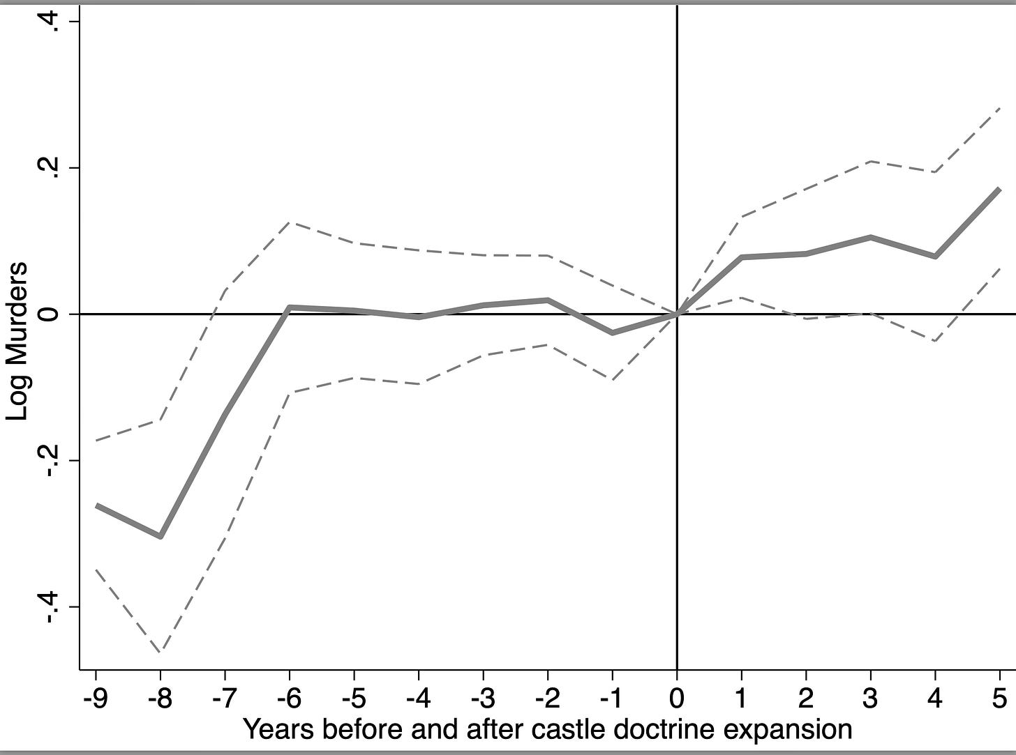
The above event study is from “Social Media and Mental Health” by Luca Braghieri, Ro’ee Levy, and Alexey Makarin. It was published in the 2022 American Economic Review. And this picture is one you see more and more often — it’s what I call “all the diff-in-diffs” picture. You create an event study figure with “all the diff-in-diffs” on it. And that’s usually TWFE versus four other robust DID estimators (robust for differential timingI mean). I have a longer explainer of this paper here if you want to read more about it.
I really only want to bring one thing to your attention, though, for this substack and that’s the comparison of TWFE against the others. Though confidence intervals vary, and point estimates are not always zero pre-treatment, they are close to one another and close to zero. And TWFE is basically always zero pre-treatment.
But then post-treatment, you see some differences. First, TWFE finds the smallest effect, and it is not significant. Borusyak, et al. picks up effects immediately as does Sun and Abraham. But by the second period, the robust estimators are all different from zero. And then dramatically in the third period, three of the estimators (SA, CS and dCdH) have identical point estimates and nearly identical 95% confidence intervals and are not only different from zero, they are also different from TWFE. BJS is different from zero but not different from TWFE.
So I come away with two conclusions: first, had we done this study six years ago using TWFE, we would’ve ruled out that Facebook caused harm to young college students. But now we don’t come to that conclusion. The second conclusion is that once you use methods that are robust to differential timing, there does appear to be effects regardless of which estimator is used.
Generative AI at Work
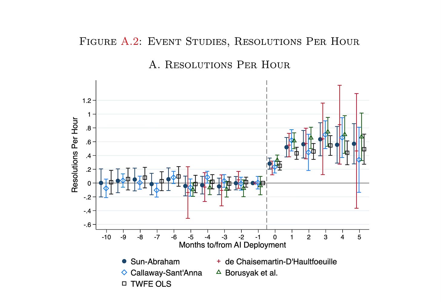
The second paper I want to show you is the one by Brynjolffson, et al. that I mentioned at the top of this. Like Braghieri, et al. they also present the “all the diff-in-diffs” event study plot, though they only show this in an appendix, whereas Braghieri, et al. presented it as a main result. But that’s for another substack.
The outcome here is a customer service agent, treated with a chatbot, resolved problems with ac customer per hour. And like Braghieri, et al., they plot TWFE (black square) against the four standard robust DiD estimators. And what jumps out to me is that unlike the Braghieri, et al. graph, there is no sign of TWFE bias in the post-period.1 The TWFE estimate is largely in agreement with the others.
So here’s my point: why? Why was it that the Braghieri, et al. graph suggested TWFE was biased under differential timing, but Brynjolffson, et al. suggests it isn’t? And to understand that, I’m going to just briefly remind you of what TWFE is estimating. I’ll run through Sun and Abraham real quick, and then I’ll show you a 30 minute video of me on my Apple Vision Pro, seated on the moon, doing an explainer too. Note, I’m still getting the hang of how to use the Pro and so the camera is shaky. You have to really focus on the thing you’re looking at otherwise you’re moving the camera around a lot because the camera is your head.
Sun and Abraham decomposition of event study lead and lag coefficients
For this, let’s say we are estimating that standard event study (“dynamic specification”) using TWFE, the one above. Sun and Abraham (2021) decomposes the population regression coefficient on each of those leads and lags which will allow us to better understand why Facebook lags were probably biased, but not the chatbot ones. To help me, here’s what each regression coefficient is equal to.
Before we get started, some comment on the notation. The regression coefficient is a weighted average over each event group’s relative event time. So let the relative event time be for our case t-2. And let there be three timing groups. Then mu_t-2 is just the weighted average over each of those three timing groups own t-2 coefficient.
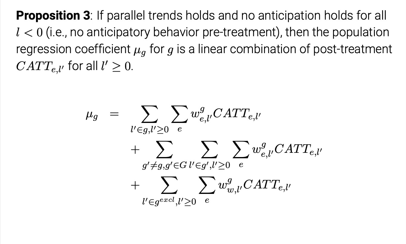
When estimated with TWFE, the t-2 coefficient is equal to the sum of three things which I’ve labeled “Targets” (top row), “contamination from other leads and lags” (second row), and “Contamination from dropped periods” (bottom row). Each row contains a set of weights which sum to certain numbers that are different numbers by row, and those weights multiple diff-in-diff terms (“four averages and three subtractions”, specifically).
These weights are the key things. The weights on the top row sum to 1, the weights on the second row sum to 0, and the weights on the third row sum to -1. The diff-in-diffs are using comparing the change in outcome Y from some chosen period (here being t-2) to some baseline value minus the same difference for some comparison group. And the first row means the target will have a weight of 1 since our g=l, but if we had multiple leads inside one bin, then you’d be taking a weighted average over them all with weights that sum to 1.
Once you assume parallel trends, all diff-in-diff on each row become cohort ATT (CATT) for that event group and relative time period. Then when you assume no anticipation, all CATT terms in the pre-treatment period are equal to zero. Their proposition 3 notes that that is not enough for the coefficient to equal its corresponding CATT, though. While parallel trends turns each DID into a CATT, and No Anticipation sets all pre-treatment CATT=0, which will most likely eliminate the third row if the dropped indicator is a pre-period, that still leaves us with the second row. The second row is the weighted average over all of the estimated coefficients corresponding CATTs, excluding the target parameter, in both pre and post period. And whereas you’ve eliminated all the pre-period CATTs as NA set them to zero, you still have the post-treatment CATTs “seeping” into the coefficient through their weighted sums. And note, since the weights on the second row sum to 0, some of them are negative and it’s unclear the direction of the bias, only that it is there unless we are willing to make one more assumption and that is that all of the treatment effects are the same, or what they call “homogenous treatment profile. And under homogenous treatment profile, the second row is eliminated. So then what is “homogenous treatment profile”?
Heterogenous treatment profile versus Homogenous treatment profile
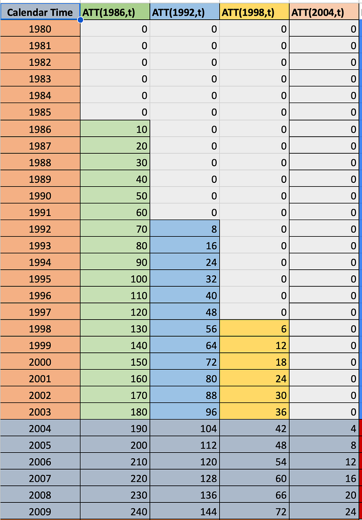
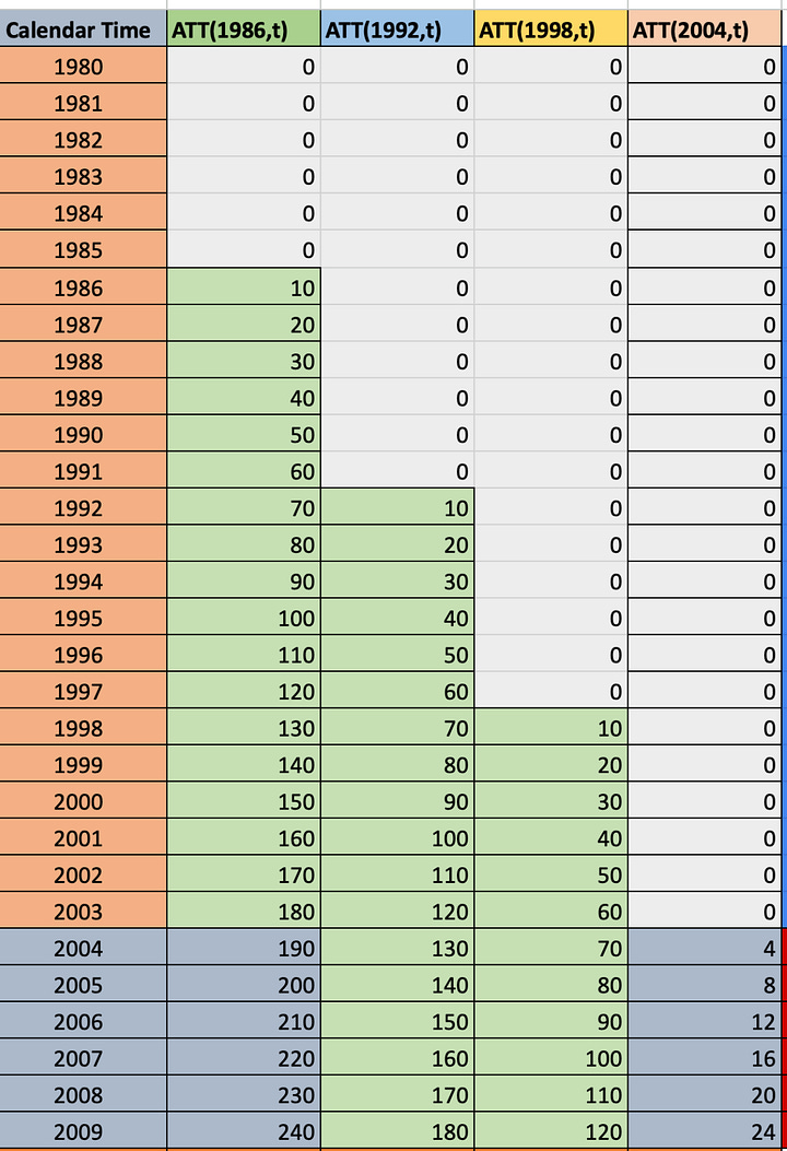
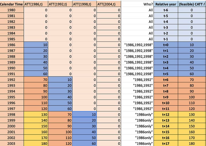
To help you understand the difference between heterogenous treatment profile and homogenous treatment profile, look at these two spreadsheets. Each cell contains a CATT for that period. In 1986, the 1986 group had an ATT of 10. In 1987, it was 20 and so on. Notice, though, that the spreadsheet on the left has heterogenous treatment profiles in that the 1986 group saw its treatment effects rise by 10 each year, but the 1992 group only by 8, and so on. The time path of the treatment effect dynamics are different in other words in the first graph. But int eh second graph, notice that every timing group has the same dynamics. They all start at 10 and grow by 10.
The target parameter in an event study is a weighted average over all relative time period ATT. And it would look like this:
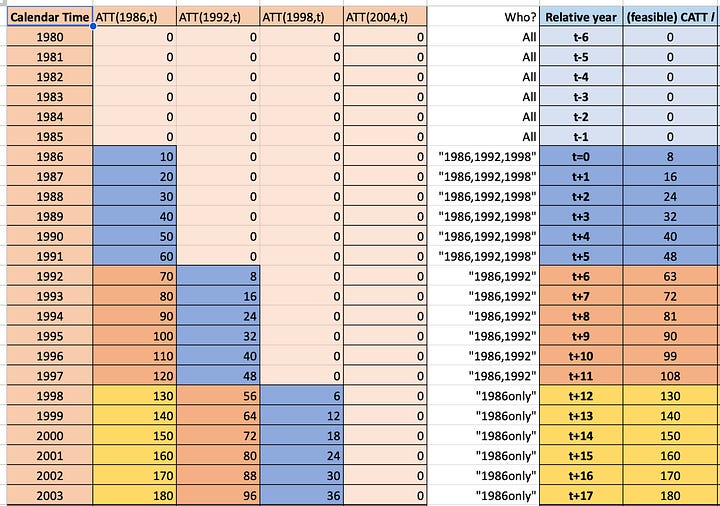
So, on the left panel, far right column labeled “Relative year”, I have to right a column labeled “(feasible) CATT”. And notice how it’s a weighted average over each timing group’s CATT for that relative time period. And as we go down the rows, once we reach a point where an event group no longer has an estimated coefficients for that more distance period, it drops out, and we are weighting on the next two, which happens again and in the end we are only estimating lags for the earliest treated group. This kind of imbalancing happens with differential timing for the longer lags. It’s not exactly sample selection, as it is not biased. Rather, it is just a weighted average over a group of units where some units are dropping out as time passes because they are late adopters and late adopters, by definition, won’t have the longer time period post treatment compared to the earlier ones.
The picture on the right is the “homogenous treatment profile event study" and notice that those event time coefficients are identical to the time path for the first group, the second, and the third. That’s because each group has the same treatment effect time path, and so taking a weighted average over them will equal itself, and all the contamination will cancel out because the weights sum to 0 and they are multiplying the same number for that relative time period.
Randomized rollouts versus selection
In this decomposition by Sun and Abraham, though, is the key to why the Facebook graphs were probably biased, but not the chatbot ones. And I think the idea is really simple: randomization.
If the rollout of the treatment is random, then it is independent of potential outcomes, and if it is independent of potential outcomes, then it is independent of treatment effects too. And that means that on average, all the groups will be balanced with respect to covariates, but also potential outcomes. And so when the rollout is random, each group is likely to have the same treatment effect profile, and therefore TWFE will be unbiased as you’ll satisfy “homogenous treatment profile” and the second row cancels out.
But if there is selection into treatment such that the earlier groups have different treatment effect time paths than the later group, then you have heterogenous treatment profiles and the second row won’t cancel out.
Well, think about it. We know Mark Zuckerberg wasn’t randomizing Facebook across campuses. He explicitly targeted the elite schools first. And interestingly, the authors found that the baseline mental health was much lower for the early adopters than it was for the late adopters. And throughout the paper, they show that the effect of Facebook was different for those closer to the edge of already having mental health problems, so we might expect already that because Facebook is targeting some schools precisely because of factors that are correlated with mental health that the treatment effect dynamics may differ for the early groups than the late groups, hence why TWFE is biased downward — the second row is not canceling out, in other words.
But then what about the chatbot? The generative AI quasi-experiment is not one we know much about, but think about it for a moment. The source of the bias in the rollout would be if the treatment is targeting groups who differ by potential outcomes — meaning selection on the treatment effect profiles. And while it is entirely possible that they could be doing that, in some ways I guess it seems less obvious to me not just that they would, but rather that they would even know how to. Very little is known about generative AI and its impact on workers, for instance. Furthermore, this is probably not being driven by some exotic marketing strategy the way Facebook had been in order to achieve market position and maximize profits across a market. This was likely a firm just trying to scale it up as quickly as they could. All of which points to the idea that maybe the chatbot roll out was “as good as random”, and if it is as good as random, whereas the negative weighting problem is still there, it most likely is neutered by the fact that all the CATTs for each relative time period are the same, or there just isn’t a ton of heterogeneity in the first place. But it would be interesting to see if it was randomized by just looking at baseline skill for each group and seeing how different it is. Do they seem to be targeting groups of workers of differing skill at different moments of time? IF so, then the mean values of baseline skill will differ across timing groups, but if not, it suggests it was randomized given they do find evidence of heterogenous treatment effects by skill and tenure throughout the paper.
Apple Vision Pro explainer
And now comes the fun part! I’m going to try to explain this stuff using my Apple Vision Pro in as quick a video as I can. So tell me what you think. And I think going forward, I’m just going to stick video explainers by the paywall until I figure out better how I want to handle it. But here you go! I tried to make this a 7 minute video, but accidentally turned the Siri timer off, so it turned out to be 20 minutes. But I think it was still nice and I hope you enjoy it!


